STARTING POINT
As Senior Product Designer at BlackRock, I worked with the iShares team, the world’s largest Exchange-Traded Fund (ETF) provider, offering a wide range of low-cost, diversified investment solutions to both individual and institutional clients. iShares is a platform that supports investors in accessing and managing their ETF portfolios, combining robust financial tools with seamless user experiences to meet the demands of the rapidly evolving financial market.
My role was focused on transforming complex financial data and concepts into user-friendly, intuitive experiences. I collaborated closely with cross-functional teams to drive innovation in user experience (UX) design while ensuring alignment with business objectives and regulatory standards.
Champions of Investor Progress
iShares redesigned to enhance user experience, simplifying ETF discovery, trading, and portfolio management for investors of all levels.
Position
Sr. Product Designer
Year
2021
Services
Product Design
Visual Design
UI/UX
Research
User Testing
Tools
Sketch
Adobe CC
Miro
Microsoft Office
01 | INTRODUCTION
Despite being a leader in the Exchange-Traded Fund (ETF) market, iShares by BlackRock was facing challenges in connecting with younger investors—a demographic that is increasingly important for future growth. While the platform was well-regarded by institutional and experienced investors, younger users found it difficult to engage with the site, as it felt dense and overwhelming. With growing competition from fintech startups offering accessible and user-friendly investing tools, iShares needed to modernize its platform to better appeal to new, digitally native investors while still serving its core audience of financial professionals.
The goal of the redesign was twofold:
- Modernize the digital platform to create a user-friendly, visually appealing experience that resonates with a broad audience, including Gen Z and Millennial investors.
- Streamline the content and navigation to ensure users could easily find and understand ETF products, regardless of their financial knowledge or experience level.
This redesign aimed to strike the right balance between education, ease of use, and the complex financial information required by professional investors, ensuring that the platform was responsive, accessible, and inclusive for all.
PROBLEM STATEMENT
BlackRock’s iShares platform needed a comprehensive redesign to enhance the accessibility and usability of ETF investing for a broad spectrum of users. The platform served both individual investors with limited financial experience and seasoned financial professionals, posing a significant design challenge: how to present complex financial data in an intuitive, visually appealing manner while retaining the necessary depth for expert-level users.
The primary challenge was to build a user interface that could cater to varying levels of financial literacy. It had to offer simplicity for beginners—helping them easily understand key features without feeling overwhelmed—while simultaneously equipping experienced professionals with advanced tools for efficient portfolio management and data analysis. The goal of the redesign was to bridge the gap between ease of use and robust functionality, ensuring the platform could deliver a seamless, inclusive, and optimized user experience across diverse investor needs.
02 | RESEARCH & INSIGHTS
To start, I led a series of user research initiatives, including interviews and usability tests, to gather insights from both professional and amateur investors. The key findings included:
- Overwhelmed First-Time Users: Younger investors felt daunted by the amount of financial jargon and the depth of content on the platform, making it difficult to navigate without advanced financial literacy.
- Mobile-First Expectations: Millennial and Gen Z users expected seamless mobile experiences. The platform’s desktop-oriented design didn’t meet their needs for responsive, on-the-go interactions.
- Need for Educational Resources: Newer investors desired educational content that was both easy to access and non-intimidating, helping them make informed investment decisions without relying on external sources.
- Preference for Personalized Tools: Both novice and experienced users wanted tools to quickly discover ETFs that aligned with their financial goals, such as retirement planning or sustainable investing.
These insights guided the design strategy, which focused on making the platform more accessible, responsive, and engaging for investors of all experience levels.
SOLUTION STATEMENT
To address the diverse needs of BlackRock’s iShares platform users, a user-centered design approach was implemented, balancing simplicity and sophistication across the interface. The redesign began with comprehensive user research, gathering insights from both novice investors and seasoned financial professionals to understand their unique pain points, preferences, and behaviors.
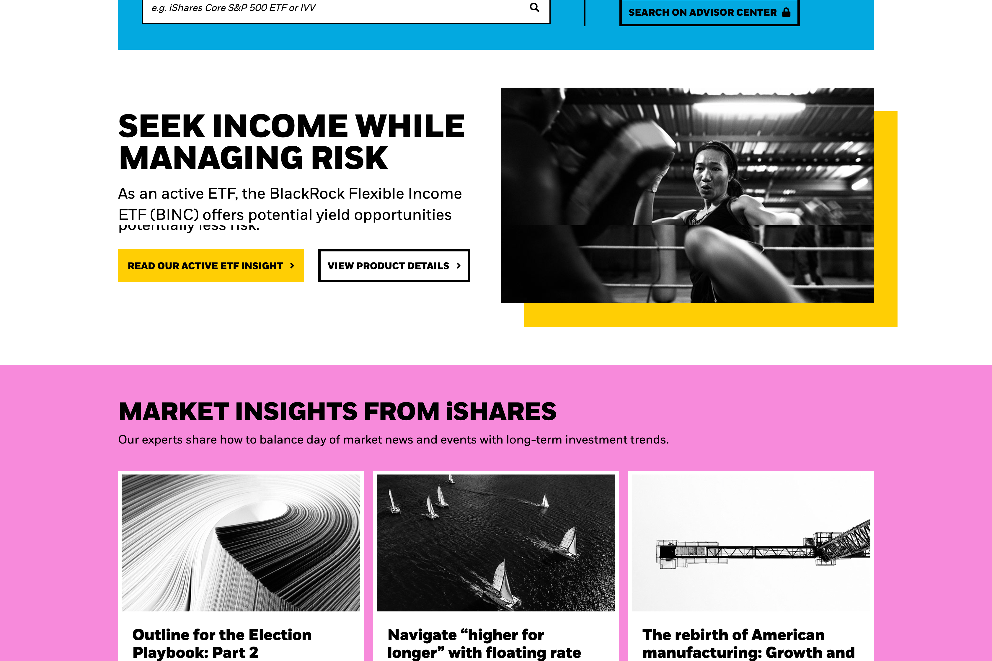
The new interface featured a modular design system that allowed for personalized experiences. Beginners were guided through the platform with streamlined navigation, simplified language, and educational tooltips, helping them build confidence in ETF investing without feeling overwhelmed. At the same time, professionals benefited from advanced dashboards equipped with powerful analytical tools, real-time market data, and customizable portfolio insights.
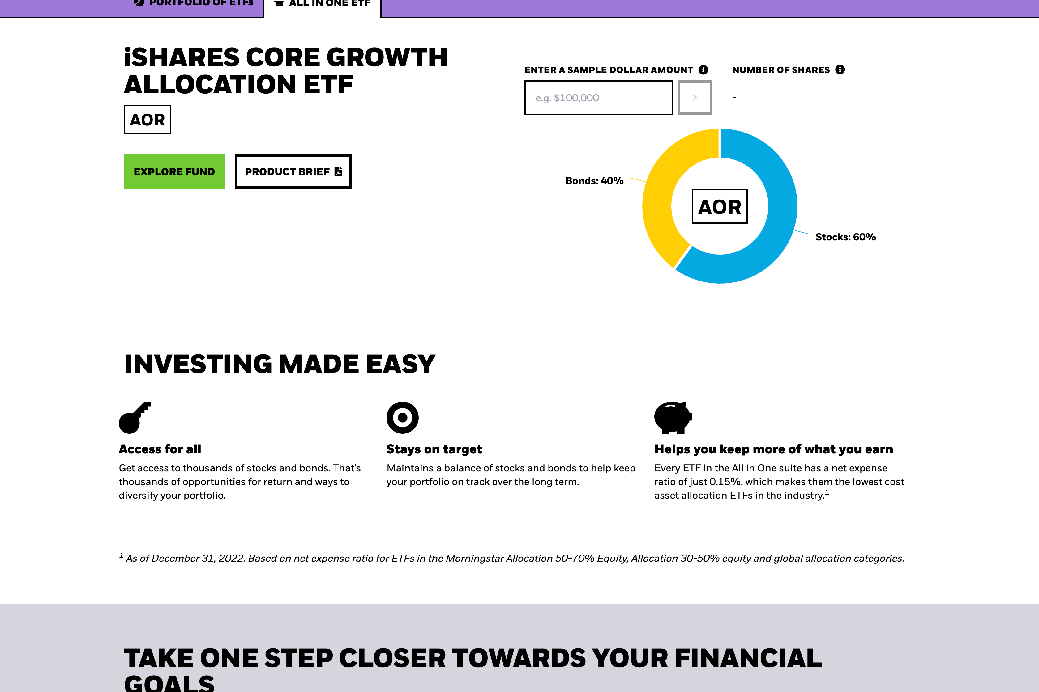
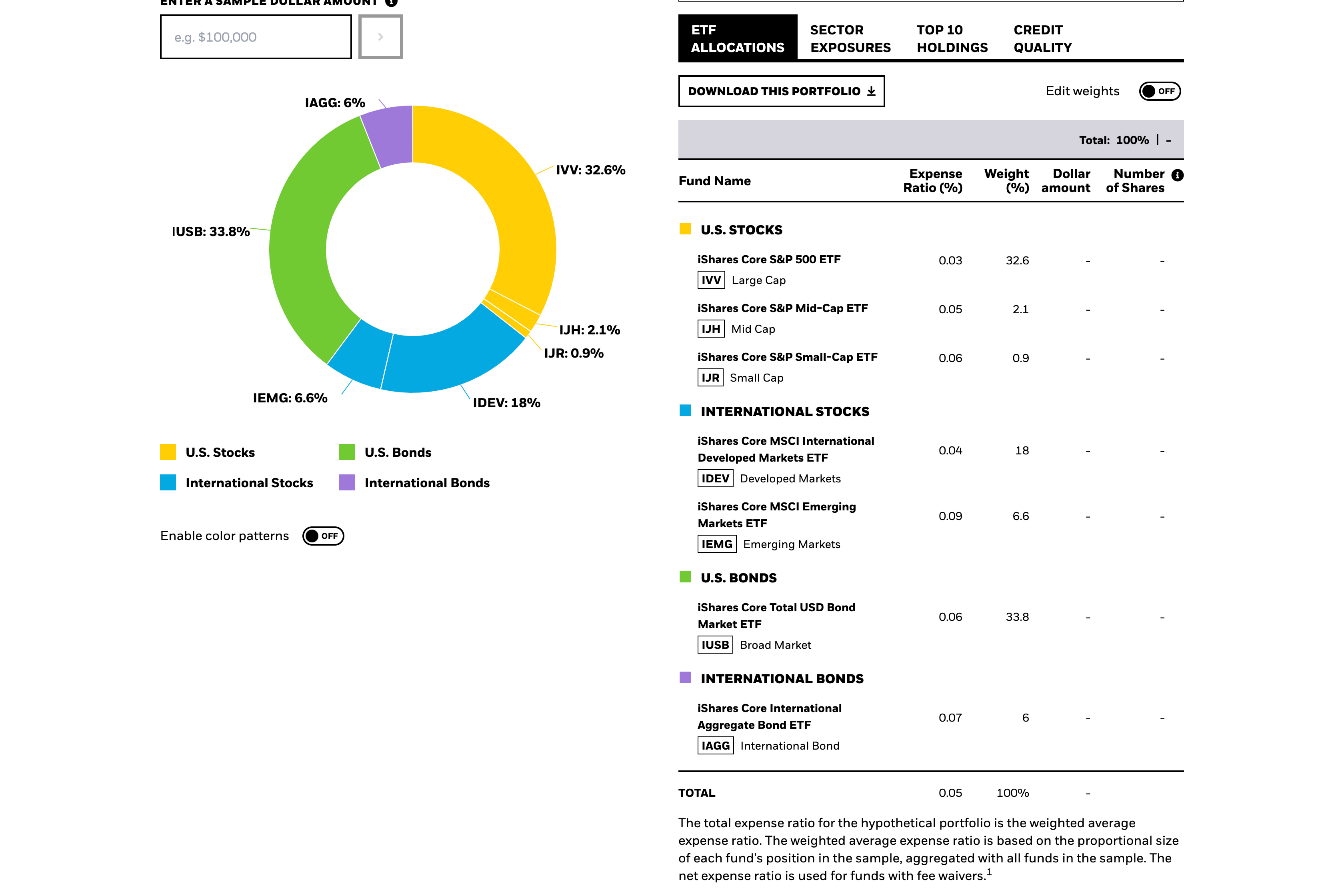
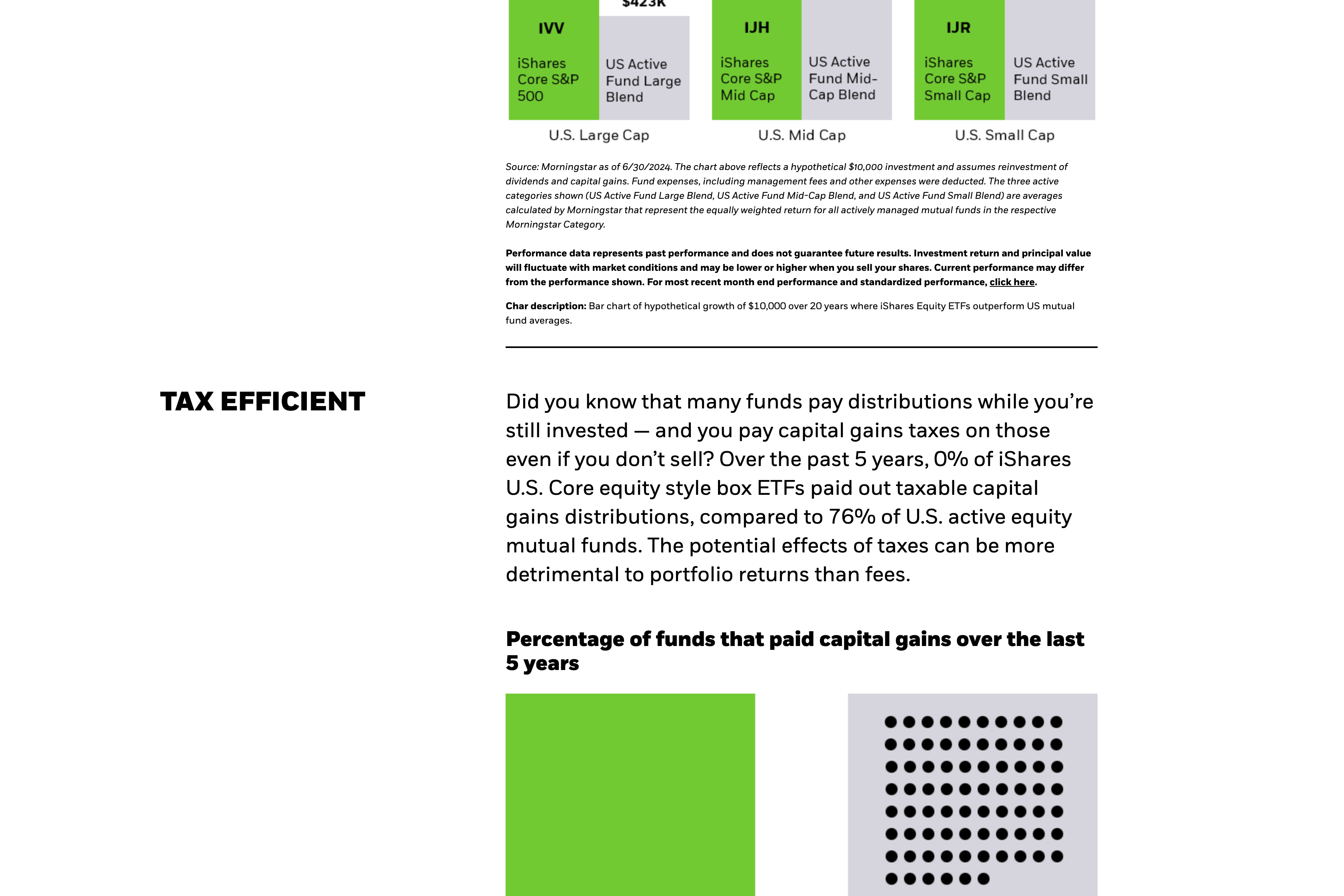
Through iterative usability testing, prototypes were refined to ensure the interface was intuitive for all user types. The design emphasized data visualization through dynamic charts and graphs, making complex financial concepts easier to grasp while maintaining the depth needed for expert users. Clear visual hierarchies, responsive layouts, and accessible design elements ensured a consistent experience across devices.
The final outcome successfully bridged the gap between accessibility and functionality, offering a seamless user experience tailored to investors of all levels. The redesigned platform empowered novice users to invest with confidence and enabled professionals to make informed decisions efficiently, ultimately enhancing user satisfaction and engagement.
03 | DESIGN GOALS
The redesign aimed to:
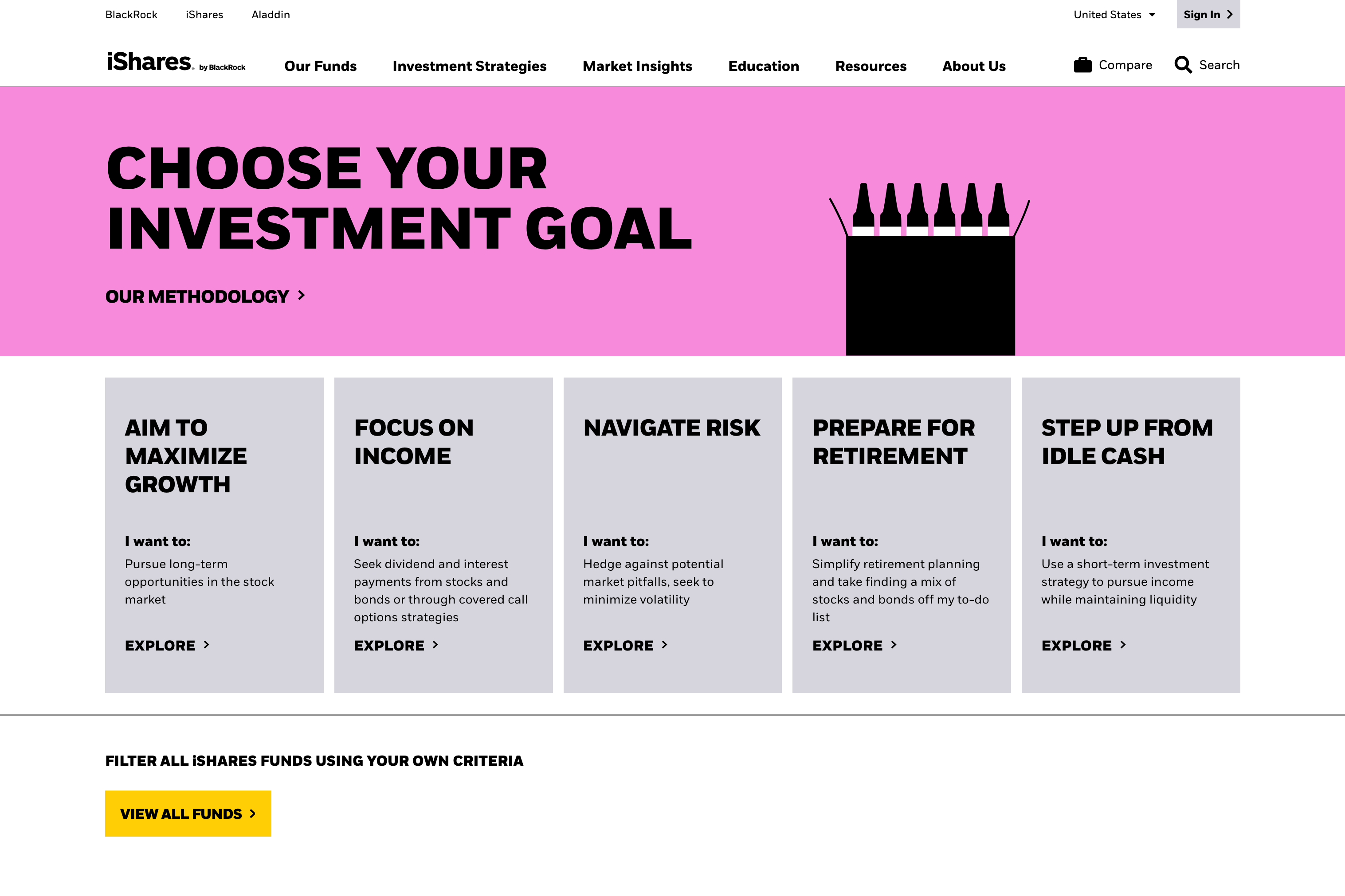
- Simplify navigation and content discovery by grouping ETFs logically and using plain language without sacrificing depth.
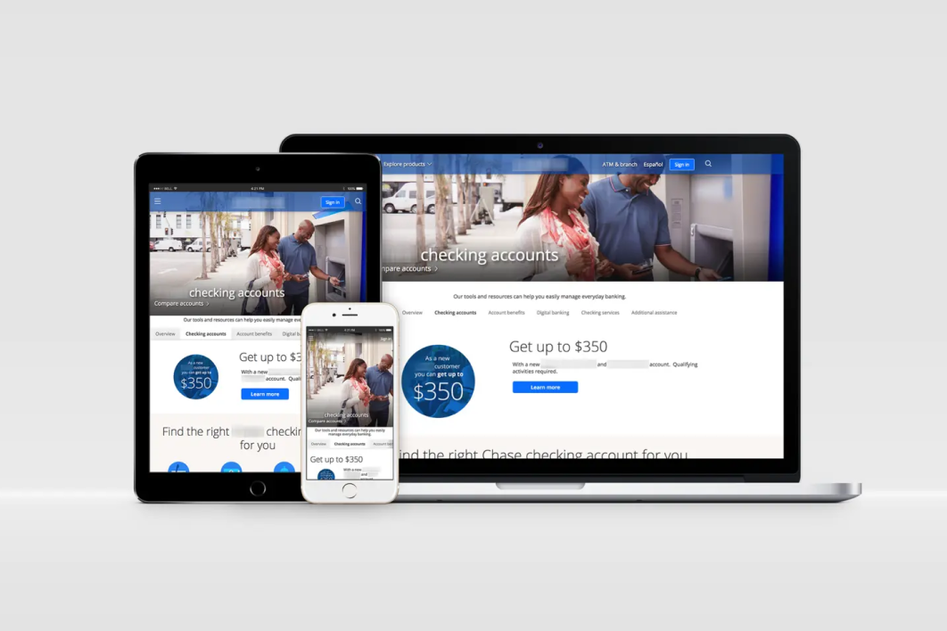
- Develop a responsive design to provide a seamless experience across desktop, tablet, and mobile devices.
- Create an investor-centric design with educational features, portfolio tools, and personalized recommendations to empower users at any stage of their financial journey.
- Maintain brand trust and compliance by preserving the professional and data-rich aspects essential to institutional investors.
Pantone® 2995 C
C100 M24.55 Y0 K12.16
#00A9E0
Pantone® 360 C
C43.56 M0 Y74.75 K20.78
#72CA33
Pantone® 116 C
C0 M19.22 Y100
K0
#FFCE00
Pantone® 2655 C
C27.19 M44.24 Y0% K14.9
#9e79d9
Pantone® 266 C
C40.08 M66.24 Y0 K7.06
#8E50ED
Pantone® 5315 C
C3.17 M3.62 Y0 K13.33
#d6d5dd
04 | SOLUTION & EXECUTION
- Streamlined Content & Intuitive Navigation
I collaborated with stakeholders to reorganize the platform’s information architecture. We created simplified user journeys that guided first-time visitors toward key actions, such as exploring ETF categories, building portfolios, or learning about sustainable investing. Dropdown menus and filtering tools allowed users to find relevant products quickly.
To improve navigability, I introduced breadcrumb trails and contextual menus to keep users oriented, even within deep product pages. Educational content was integrated into relevant areas to provide on-the-spot guidance, ensuring users didn’t need to leave the page to understand financial concepts. - Mobile-Optimized Design & Responsiveness
With a mobile-first approach in mind, I developed responsive wireframes and prototypes, ensuring the design worked seamlessly on devices of all sizes. Visual content was prioritized over text-heavy layouts, and interactive tools were optimized for touch interfaces.
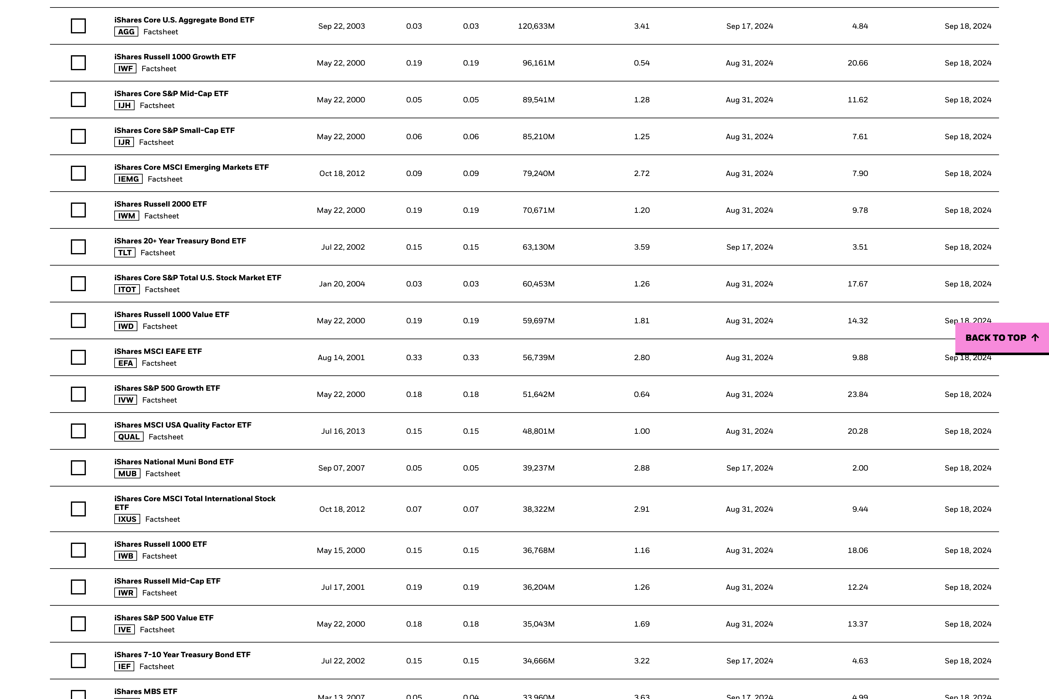
Key design elements, such as ETF comparison tables and data visualizations, were carefully adapted for smaller screens without sacrificing clarity or usability. The platform’s mobile experience allowed users to browse ETFs, access financial news, and track their portfolios anytime, anywhere. - Personalization through Investor Tools
To enhance engagement, I incorporated personalization tools that enabled users to filter ETFs based on their financial goals, interests (e.g., sustainability), and risk tolerance. Interactive portfolio builders guided users through the process of selecting funds, making investment decisions easier and more intuitive.This personalization not only appealed to younger investors but also added value for seasoned professionals seeking to manage client portfolios efficiently. - Design System Implementation
I led the implementation of a design system that ensured consistency across the platform. The system standardized UI components—such as buttons, typography, and color schemes—allowing for easy updates and scalability. The design system improved collaboration between design and development teams and ensured the platform maintained a cohesive look and feel across all devices.
05 | CHALLENGES & SOLUTIONS
One of the primary challenges was balancing the complexity of financial data with the need for an intuitive and accessible user interface. Advanced investors required in-depth analytics and detailed ETF information, while first-time users sought simplicity and ease of navigation. Another constraint was ensuring that interactive tools like fund filters and search functionalities were highly responsive and optimized for both mobile and desktop platforms. Addressing these challenges required iterative design testing and consistent feedback loops to refine the user experience across diverse investor profiles.
Balancing Complexity and Simplicity: While the goal was to simplify the platform, we needed to maintain the depth of information required by professional investors. This was achieved by layering content, where novice users saw simplified information by default, with the option to dive deeper if needed.
Regulatory Compliance: Working in a regulated industry required close collaboration with legal and compliance teams. Every design element, from educational content to ETF performance data, was vetted to ensure it met legal standards while remaining accessible to users.
Engaging Multiple User Types: Serving both novice investors and seasoned professionals meant catering to diverse needs. We solved this by using dynamic user interfaces that adjusted based on user preferences and prior interactions.
- Integrating interactive features without overwhelming first-time users.
- Incorporating real-time data updates for ETF performance metrics posed technical constraints, requiring close collaboration with the development team to ensure data accuracy without slowing site performance.
- Ensuring accessibility compliance, especially for visually impaired users, meant carefully considering color contrast, typography, and navigational elements.
- Coordinating the needs of multiple user segments—retail investors, advisors, and institutions—demanded a flexible yet cohesive design approach that could cater to each group’s unique requirements without overwhelming the user experience.
06 | RESULTS
The redesign of the iShares platform achieved several key outcomes:
Increased Engagement: The new, user-friendly interface resulted in a significant uptick in user engagement, particularly among Millennial and Gen Z investors.
Higher Mobile Traffic: Mobile visits increased by 25%, thanks to the responsive design that allowed users to access their portfolios and explore ETFs on the go.
Improved Conversion Rates: Users were able to find relevant ETFs faster, leading to improved conversion rates for product pages.
Positive Feedback from Institutional Clients: Professional users praised the platform’s improved navigation and data visualization tools, which made managing client portfolios easier and more efficient.
Conclusion
The iShares redesign exemplifies the power of thoughtful, user-centered design in transforming complex financial products into accessible tools for a broader audience. By balancing simplicity with depth and introducing personalization features, the platform became a valuable resource for both new and experienced investors.
This project highlighted the importance of collaboration between design, product management, and compliance teams in regulated industries. The design system we implemented ensured consistency and scalability, setting the foundation for future enhancements.
Through this case study, I demonstrate my ability to lead design strategy from ideation through execution, leveraging user research and cross-functional collaboration to deliver impactful, user-centric solutions in the financial services industry.


