STARTING POINT
Everyone loves a great come back story! Bank of America heard the cries of Windows users in regards to the old Windows 7 app and diligently took to task at repairing all that was wrong with the last release.
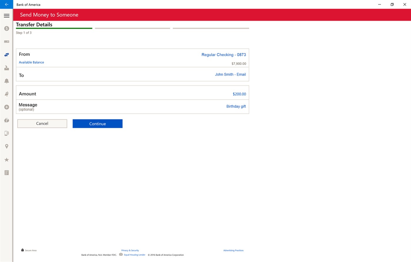
In an effort to simplify customers financial life, myself and several other team members worked closely with the Microsoft User Experience team to redesign a customized and intuitive app experience that integrates with new innovative Windows 10 features like Cortana. You can now tell your personal digital assistant, Cortana, to view your banking transactions. With the familiar voice command ‘Hey Cortana’ you can now get up to date on your account balances, directly navigate to the screens to pay bills, transfer money, find the nearest banking locations, and even contact customer service. Along with the new user interface and experience, we’re pleased by how it integrates with the app and we’re excited to see how this will evolve to be more helpful and proactive for customers in the future.
Our People, Our Passion, Our Purpose!
Position
Senior UI/UX Designer
Year
2015 — 2016
Services
Visual Design
UI/UX
Research
User Testing
Tools
Adobe CC
Microsoft Office
Jira
01 | PROJECT OVERVIEW
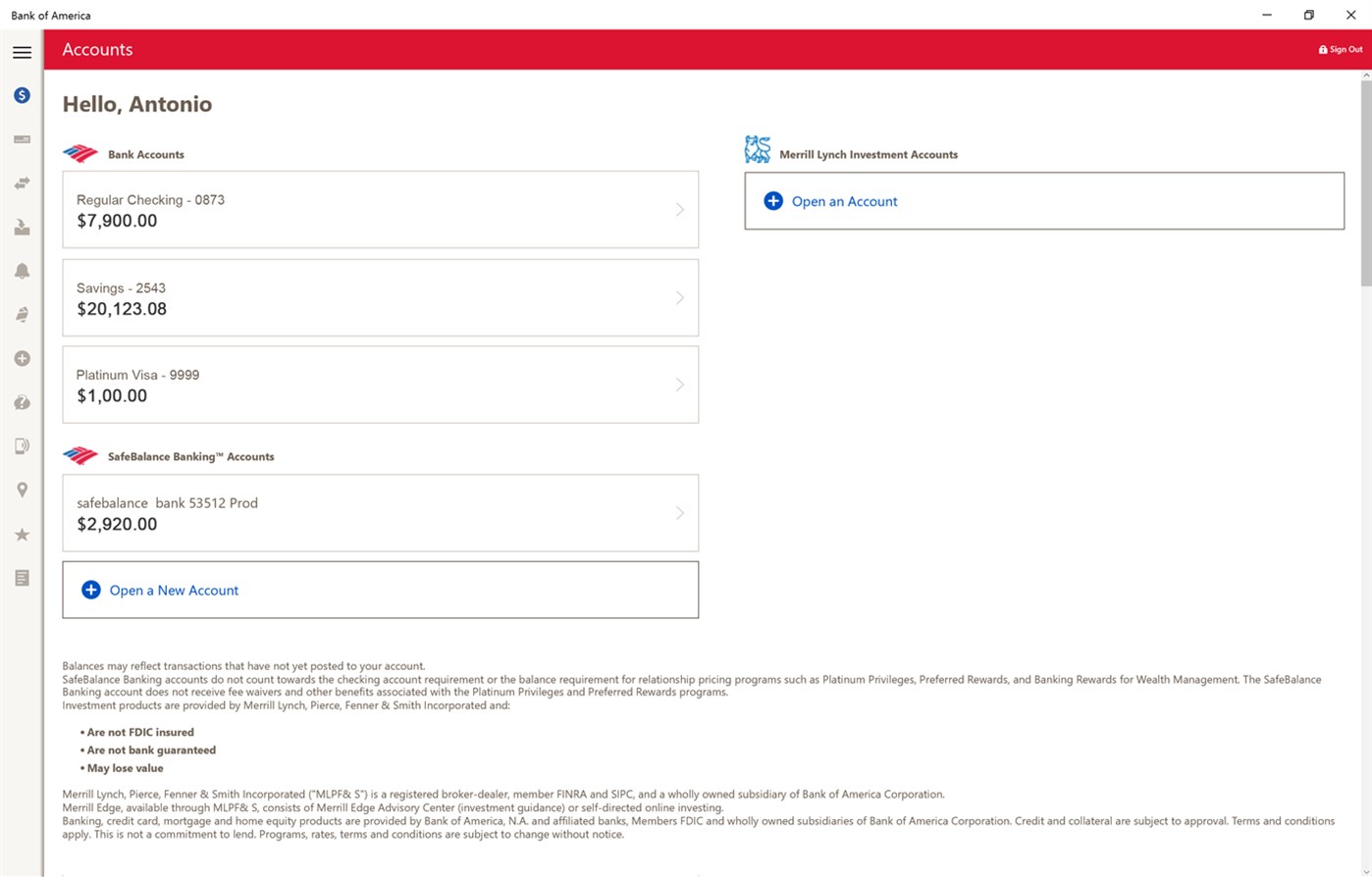
The Bank of America (BoA) Windows 10 app was a significant endeavor to provide customers with seamless banking services across desktop, mobile, and tablet devices using the Universal Windows Platform (UWP). This app aimed to create a native experience for the Windows ecosystem by integrating key financial features and leveraging the unique capabilities of the Windows 10 operating system.
The app was initially launched in June 2016, marking a return after BoA had previously discontinued its support for Windows Phone apps. This case study explores the design, development, features, and challenges of the BoA Windows 10 app, as well as the insights it offers for cross-platform banking solutions
02 | DESIGN & DEVELOPMENT APPROACH
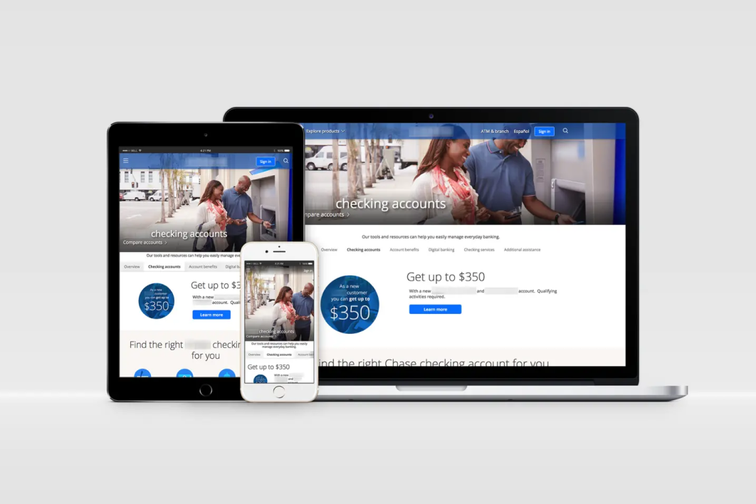
Bank of America’s app was built using the UWP framework, ensuring that it could run smoothly across different devices without needing multiple versions. UWP enabled features like responsive layouts, which adjusted to the screen size on PCs, tablets, and smartphones. The development team prioritized a clean, straightforward design to align with BoA’s brand while keeping user experience at the forefront
- Adaptive Layouts: The app used Microsoft’s Fluent Design principles to create a consistent, aesthetically pleasing interface across devices.
- Sandboxing & Security: Leveraging UWP meant the app operated in a secure, sandboxed environment with one-click uninstall capabilities, reducing risks of system interference or leftover files.
- Cortana Integration: A notable feature was Cortana support, allowing users to access banking tasks via voice commands, a first among banking apps for Windows 10.
Problem:
During our user testing sessions, we discovered that many participants used the app only to check their account balances, avoiding more complex financial transactions. When asked why, users expressed concerns about the legitimacy and security of the interface. Some participants cited technical glitches or fear of making mistakes due to their unfamiliarity with the app. However, the most common feedback suggested that the interface did not appear trustworthy enough to instill confidence in users. This lack of perceived trust became a significant barrier to engagement beyond basic account inquiries.
Solution:
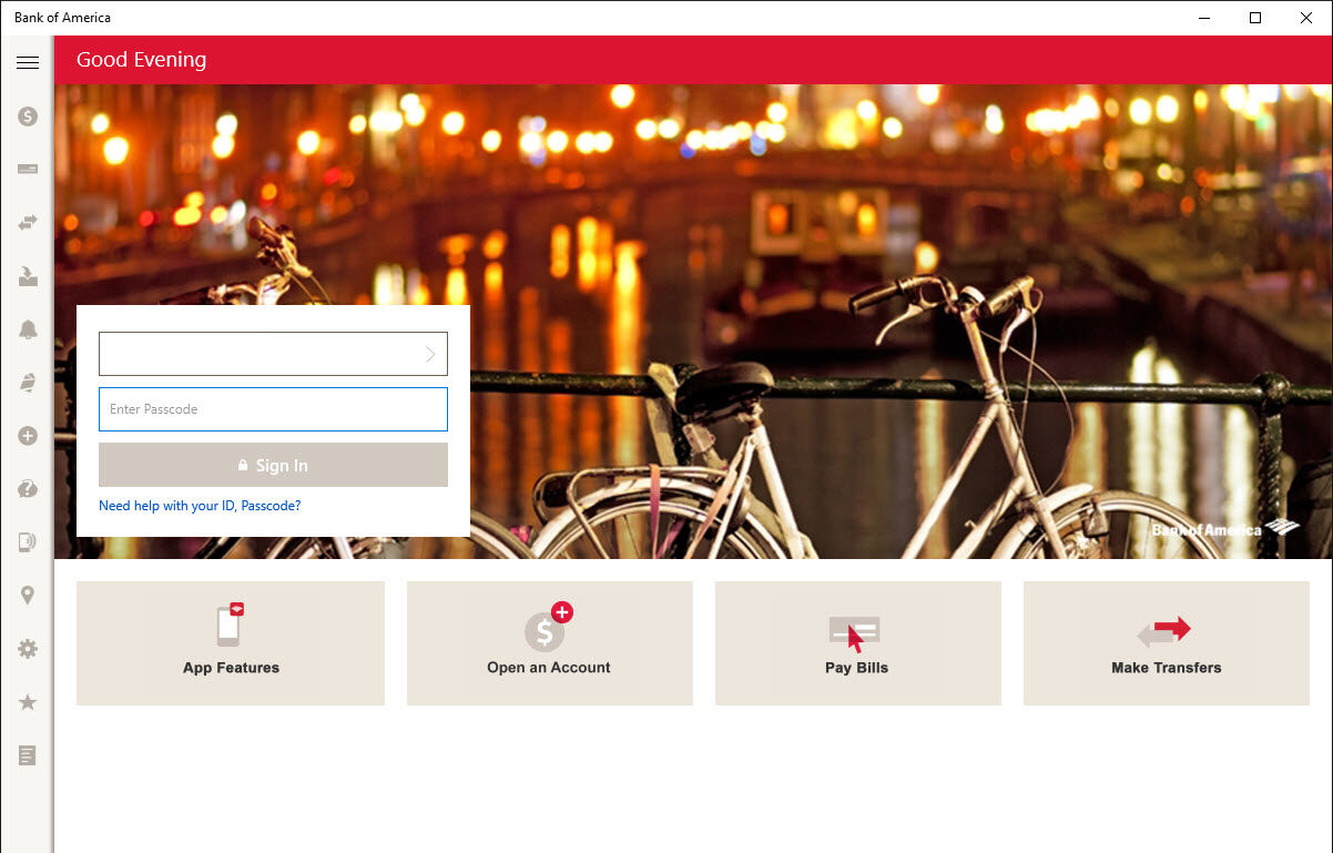
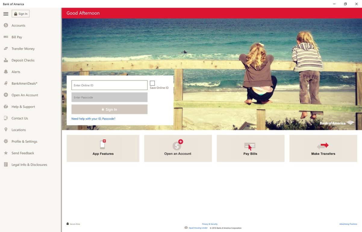
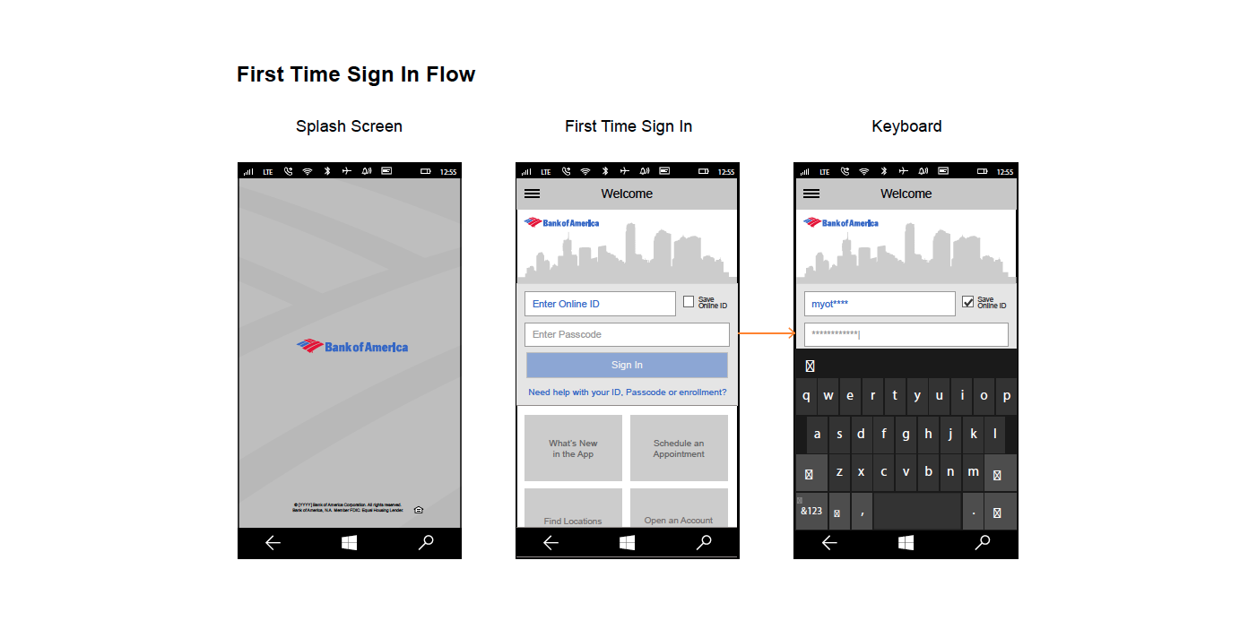
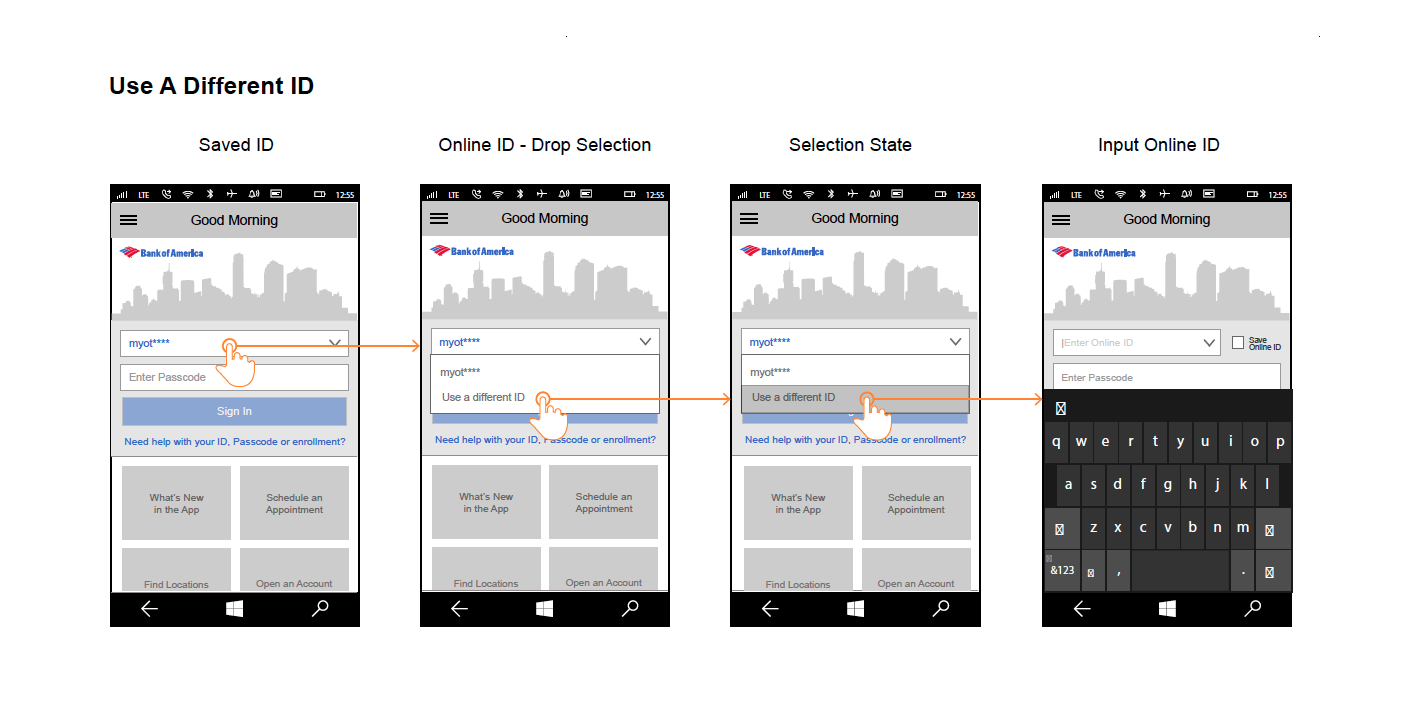
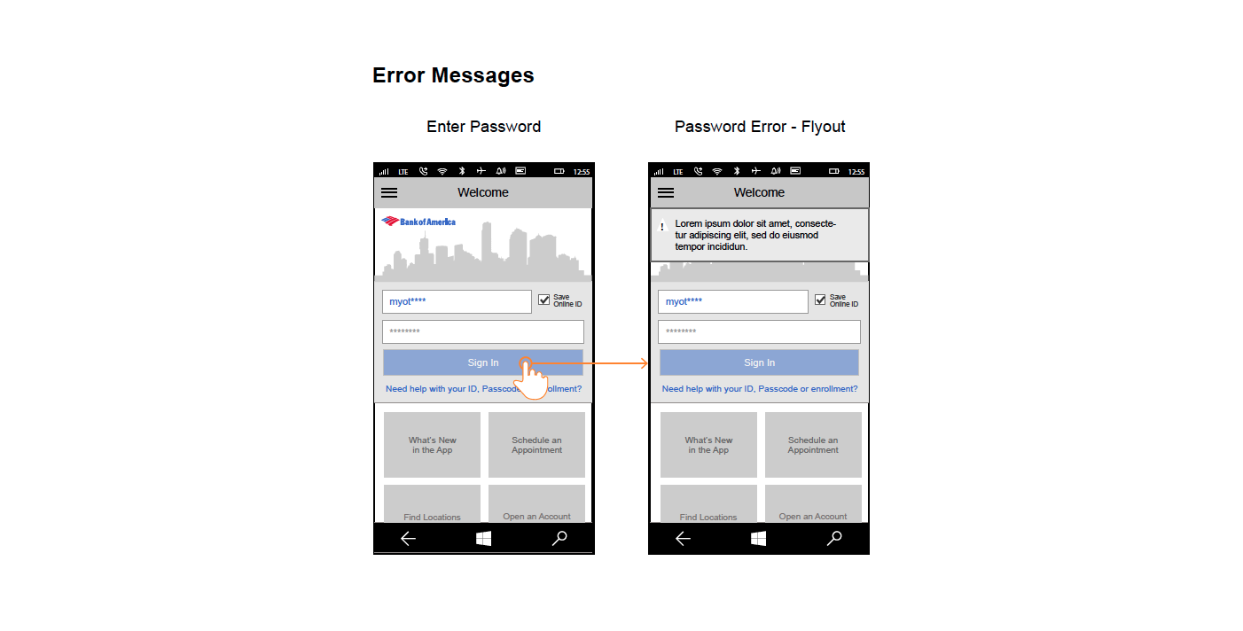
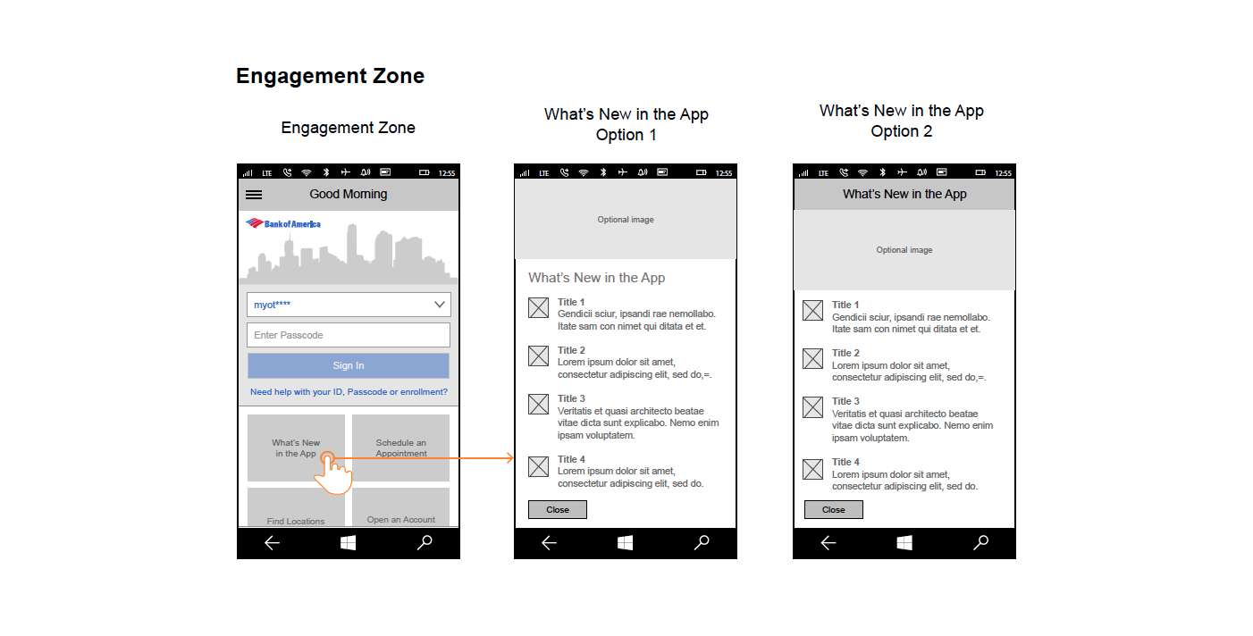
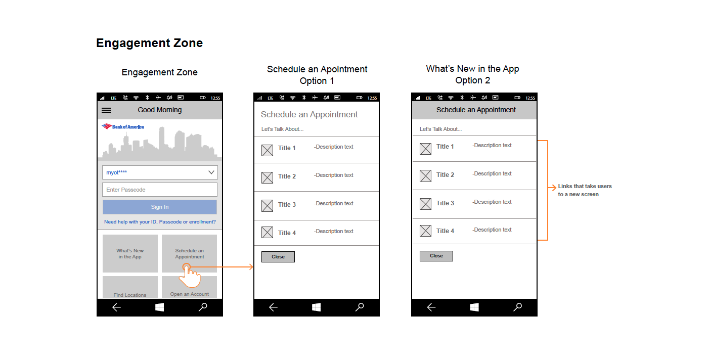
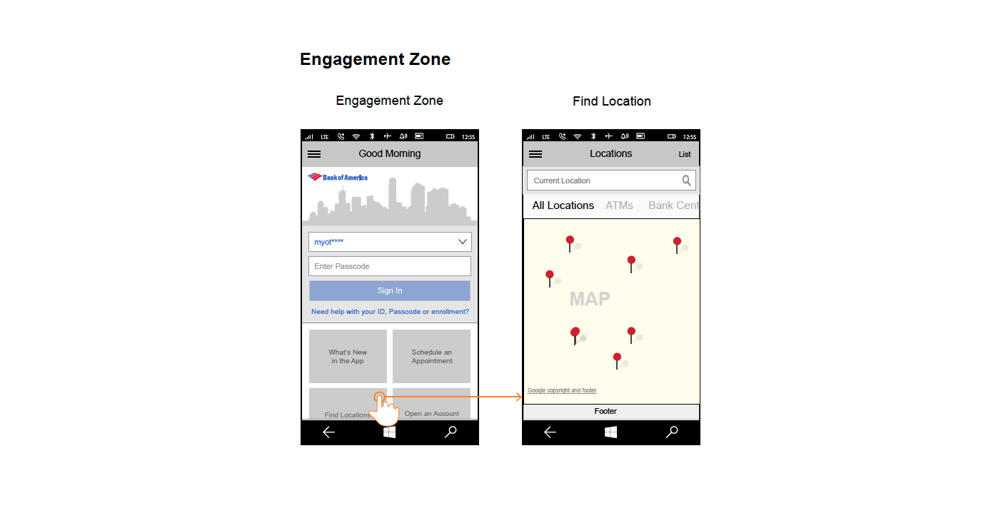
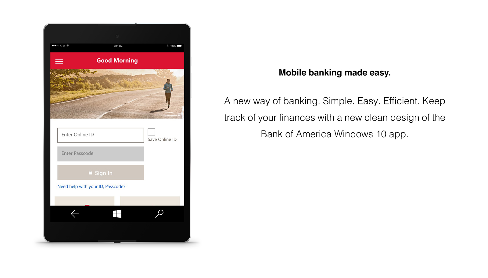
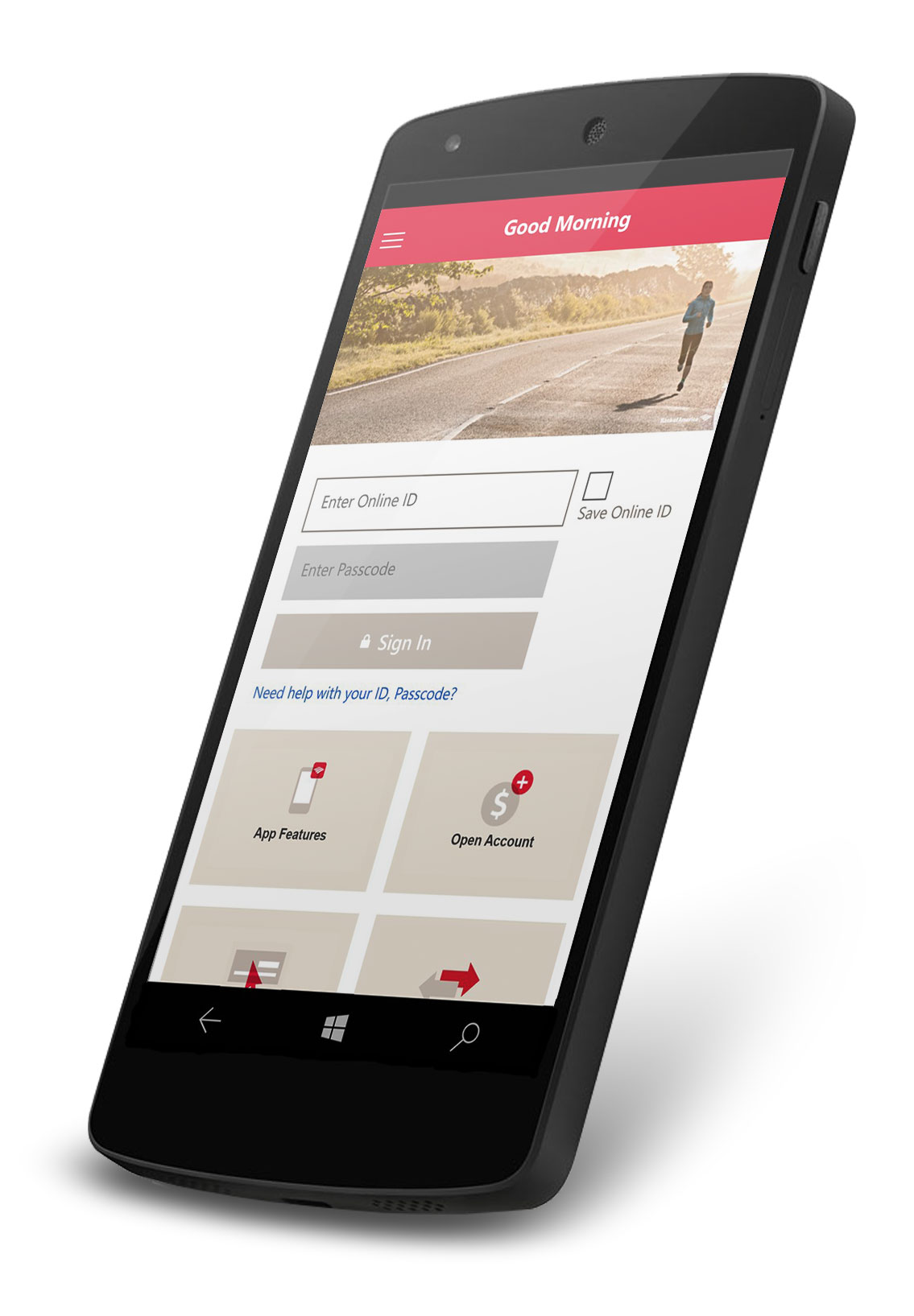
To address this issue, I redesigned the login screen with a focus on creating a more inviting and familiar experience. Drawing inspiration from traditional in-person banking interactions, we aimed to give users a sense of connection and reliability, much like the relationship one might have with a personal banker. The new design incorporated warmer visual elements and streamlined entry points to make the experience more approachable and reduce intimidation.
We also integrated Cortana voice assistance to enhance personalization, enabling users to navigate the app through conversational interactions. This redesign not only improved the emotional appeal of the interface but also gave users more confidence in performing financial tasks securely. As a result, subsequent user tests showed increased willingness to explore more features of the app, including transactions and bill payments.
03 | FEATURES & FUNCTIONALITY
The BoA app integrated key financial services to match the needs of its diverse user base:
- Account Management
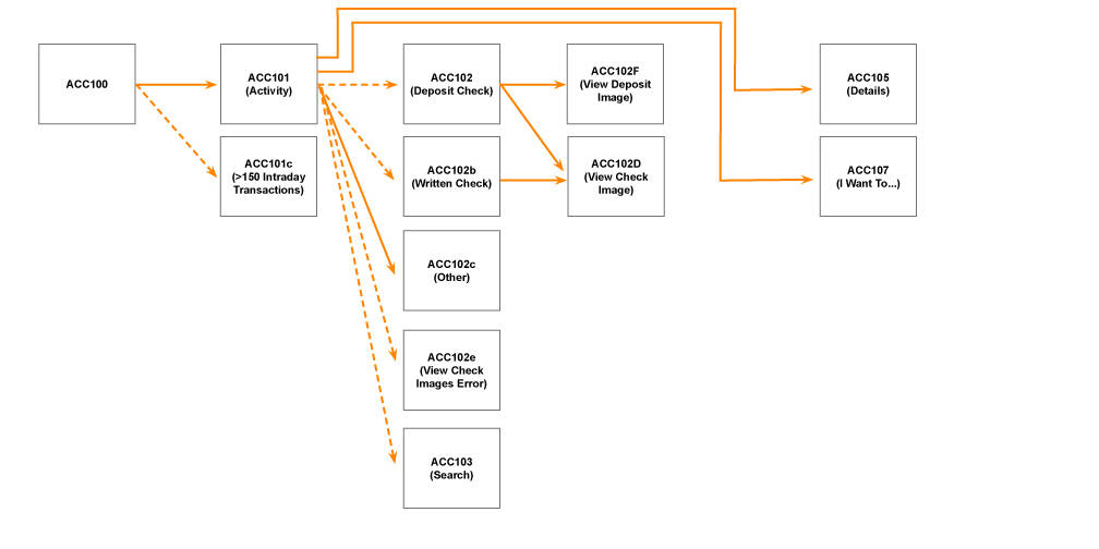
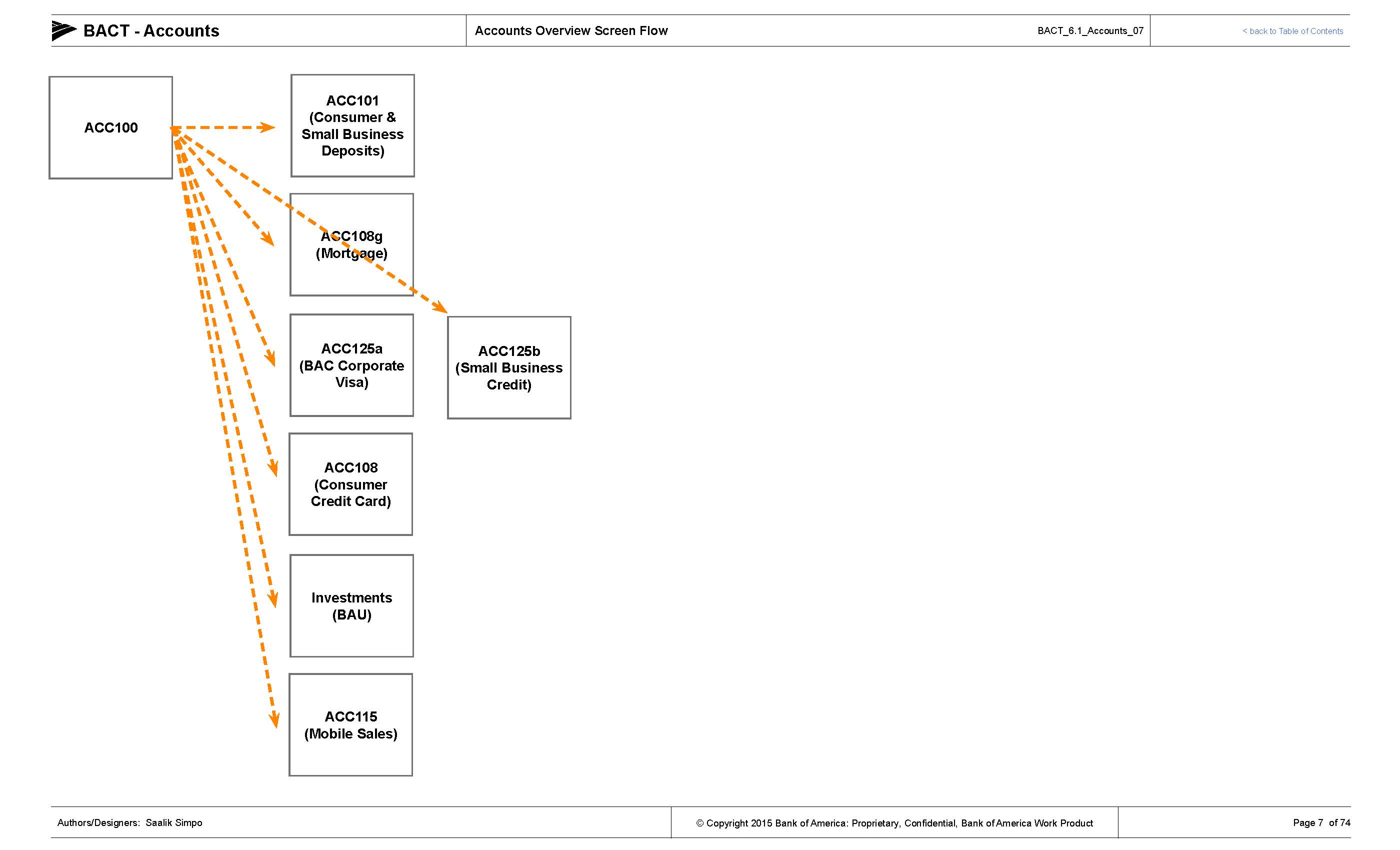
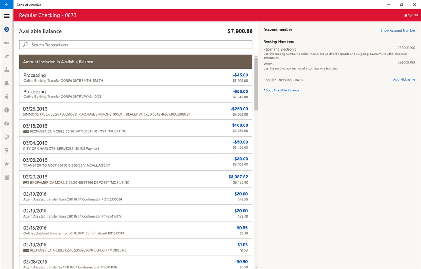
- Users could view balances and transactions for checking, savings, credit cards, mortgages, and Merrill Edge accounts.
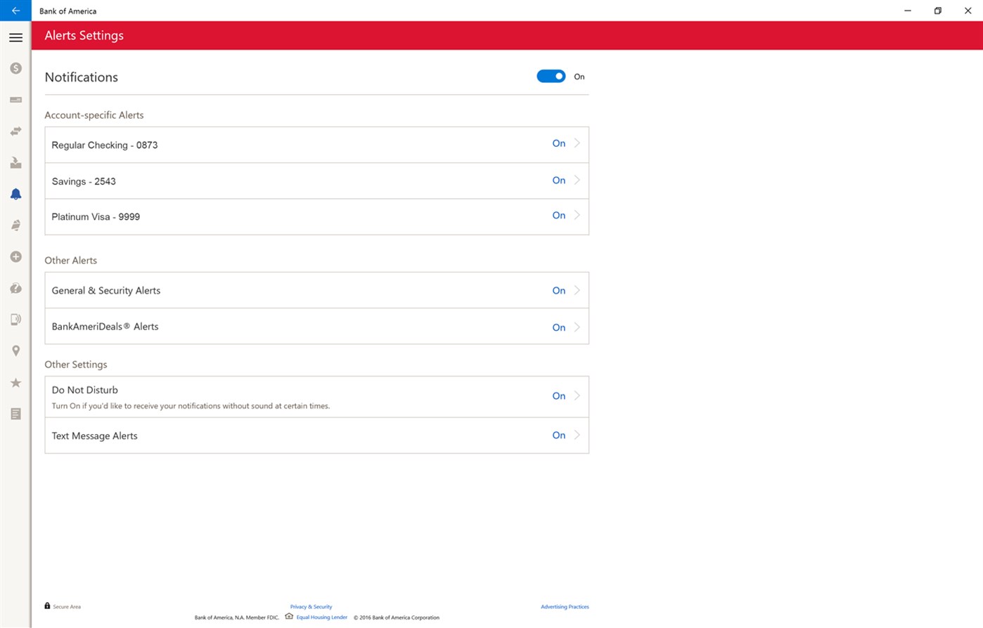
- The app supported notifications and alerts for important account activities and security updates
- Money Transfers and Payments
- The app allowed internal and external transfers using email or phone numbers.
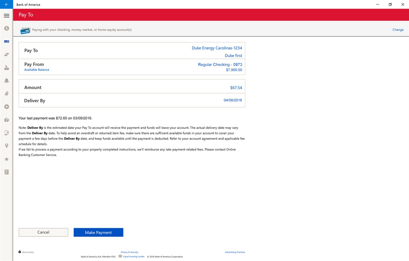
- Users could manage bill payments, edit or cancel scheduled payments, and pay eBills directly from the interface.
- Check Deposits
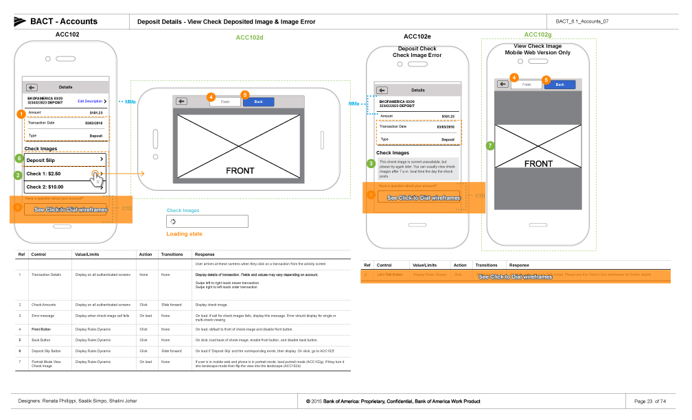
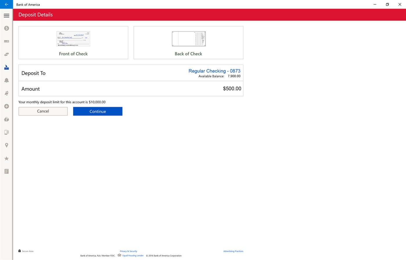
- Users could deposit checks using the device’s camera, with real-time feedback on the processing status.
- Location Finder
- The app integrated with location services to help users find ATMs and financial centers nearby.
- BankAmeriDeals® and Special Offers
- Cashback offers were accessible directly within the app, giving customers incentives to use their BoA credit or debit cards
04 | CHALLENGES & SOLUTIONS
One challenge Bank of America faced was creating an app that not only met UWP design standards but also provided the robust financial services users expected from a leading bank.
- Development Constraints: The cross-platform UWP framework required new workflows and design strategies to ensure the same quality of experience on mobile, desktop, and Xbox devices.
- Transition from Legacy Platforms: The app’s reintroduction on Windows 10 aimed to overcome negative feedback following the discontinuation of its Windows Phone app. This required the design team to focus on regaining user trust by offering a superior experience.
- Security and Compliance: Given the nature of financial apps, security was paramount. The app included robust authentication options, notifications for suspicious activity, and secure money transfers, in line with industry standards.
05 | DESIGN IMPACT & USER FEEDBACK
The app’s design was a practical demonstration of how UWP’s adaptive design principles could benefit financial services. It provided a smoother user experience compared to previous versions, reflecting a better understanding of the needs of BoA’s customer base. However, the app faced challenges regarding the limited adoption of Windows 10 banking apps. While it received positive feedback initially, BoA later pivoted its focus to iOS and Android platforms due to higher user demand and diminishing support for the Windows ecosystem.
06 | CONCLUSION & LESSONS LEARNED
The Bank of America Windows 10 app served as an example of cross-platform financial solutions leveraging Microsoft’s UWP framework. While the app eventually ceased development as BoA focused more on mobile apps for other operating systems, it remains a valuable case study on adaptive design and cross-device functionality.
Key Takeaways:
- Seamless Multi-Device Design: UWP made it easier to maintain a single codebase for all devices, but developers needed to tailor experiences based on platform-specific needs.
- Security as a Priority: For financial apps, balancing usability and robust security features is essential.
- Adapting to Market Trends: While Windows 10 provided opportunities, following where users are—such as Android and iOS—remains critical for business success.


