STARTING POINT
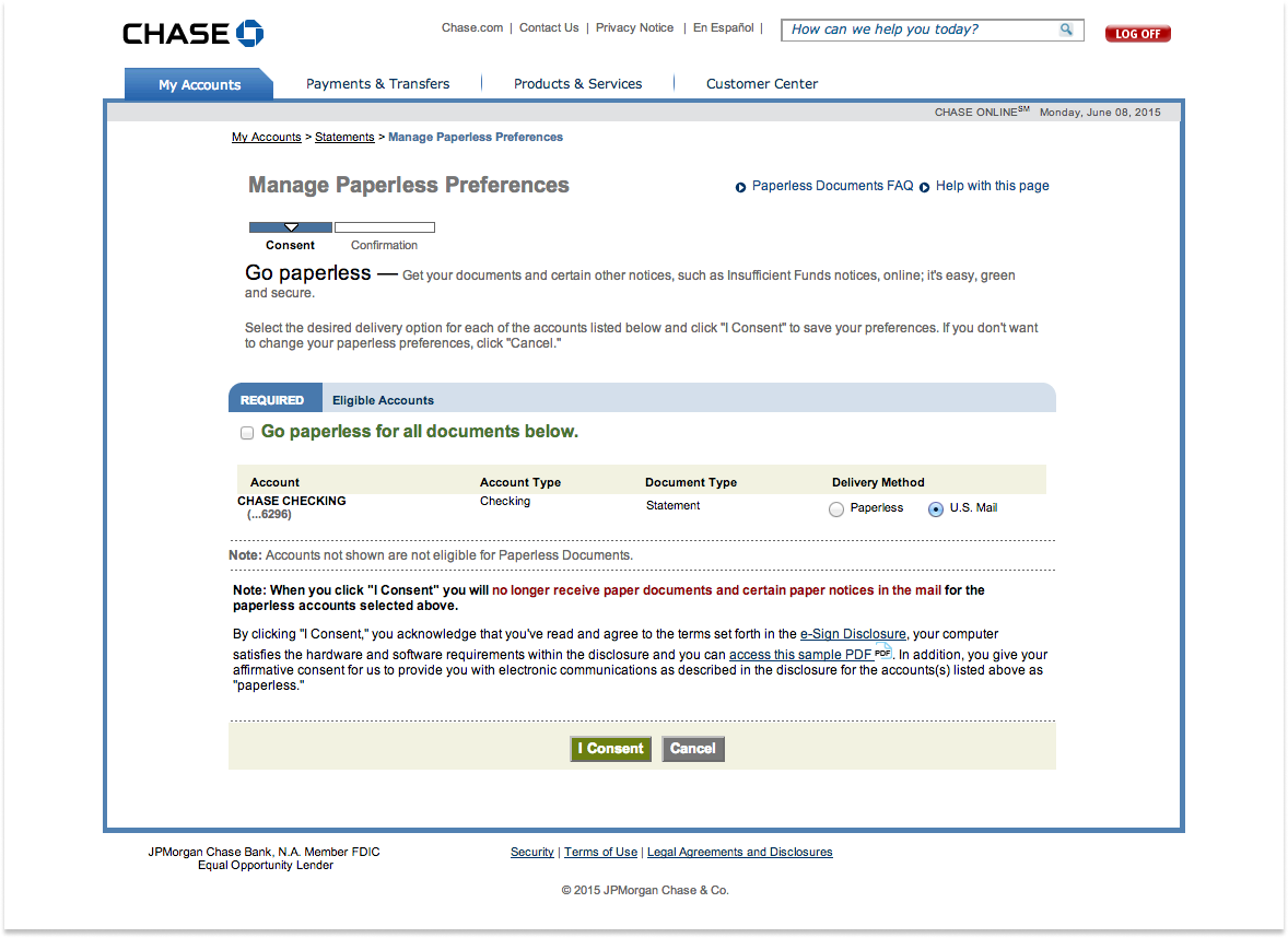
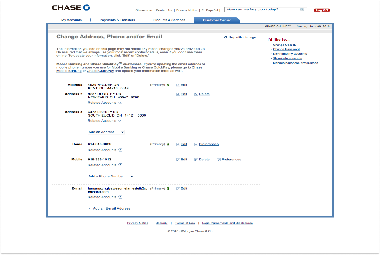
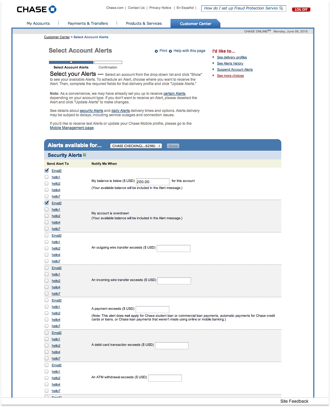
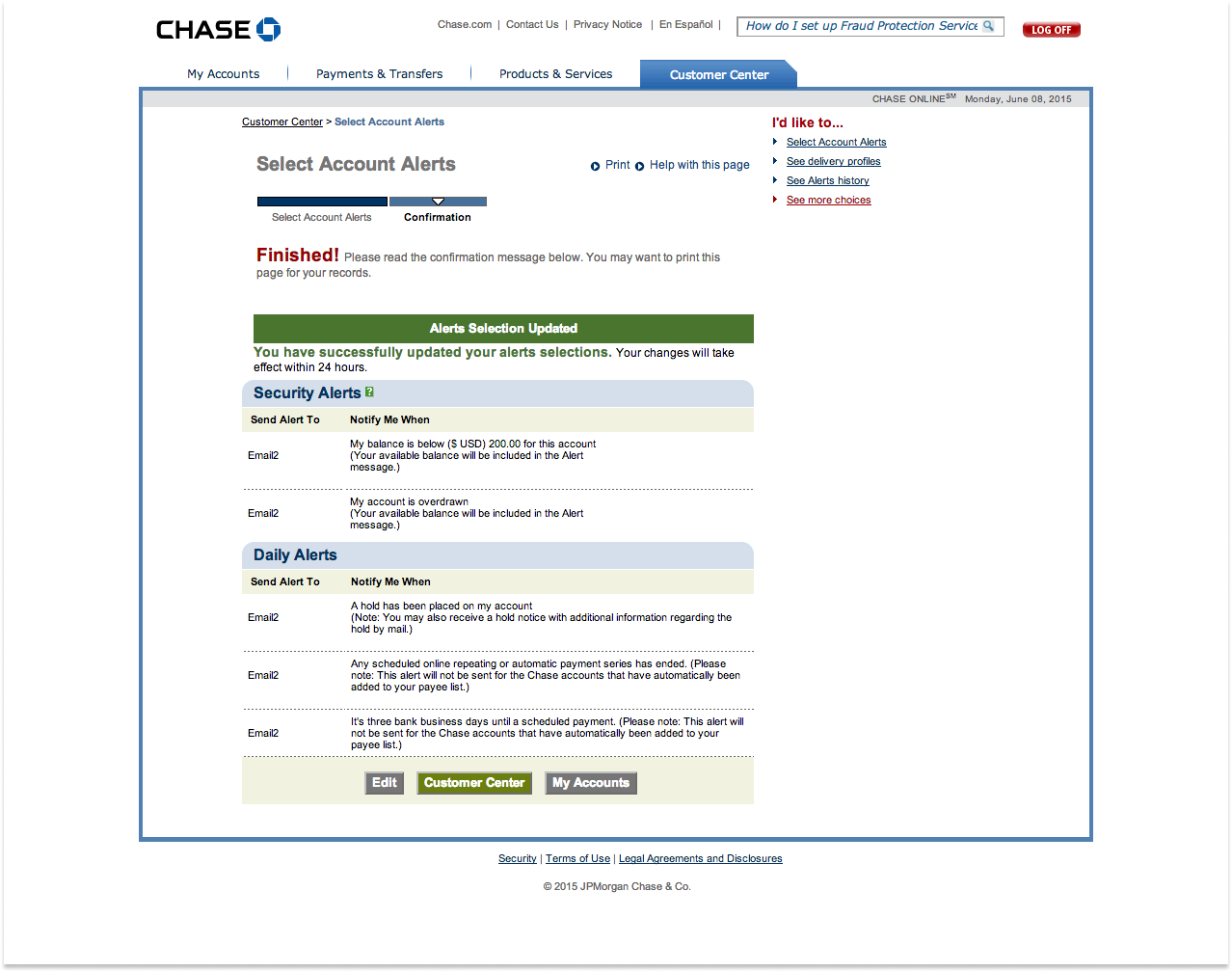
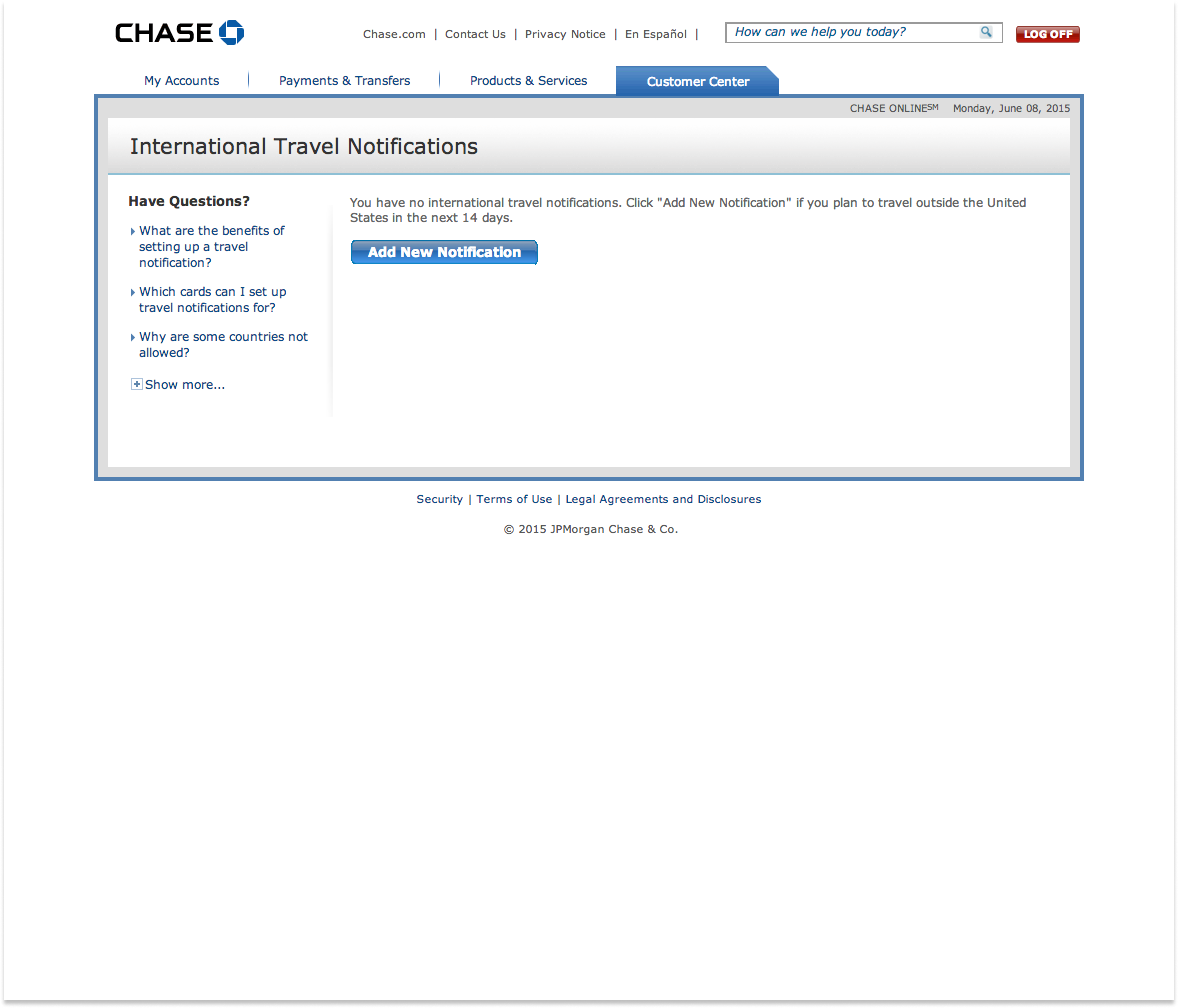
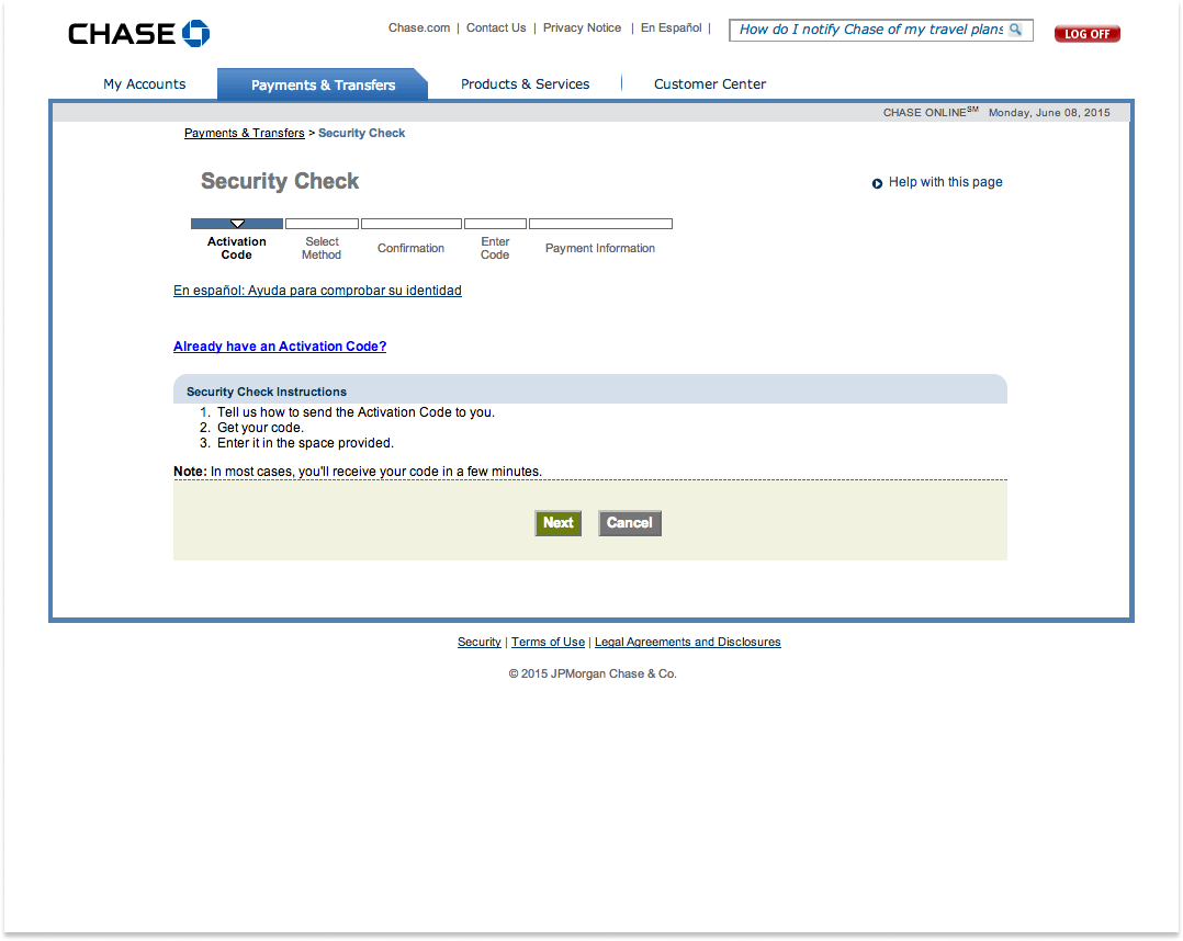
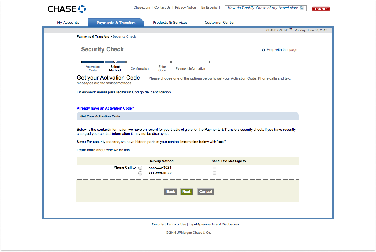
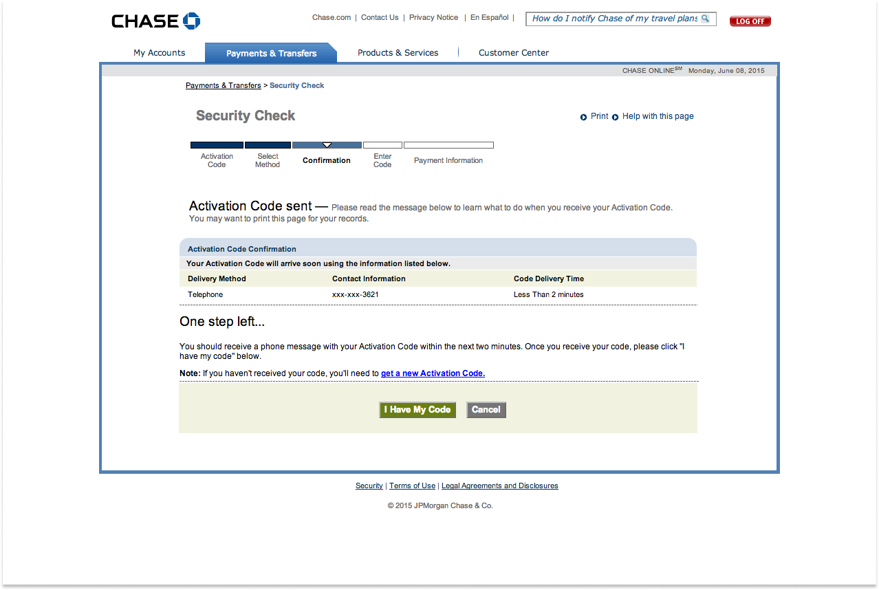
When I joined the Chase redesign project, the interface & user experience was extremely outdated and cumbersome. Particularly in key areas like accounts and user profile management. The process for completing simple tasks such as; changing an email address, transferring money, sending money, etc., was unnecessarily complex, involving multiple screens and confusing interactions. With growing customer expectations for seamless, intuitive digital experiences, it was clear that Chase needed a more streamlined and efficient solution to enhance both usability and customer satisfaction. My goal was to modernize these interactions and simplify the user journey to align with Chase’s commitment to delivering a customer-first experience.
EVERYDAY LIVING!
Humanizing banking by humanizing the customer experience.
Position
Senior UI/UX Designer
Year
2014 — 2015
Services
Visual Design
UI/UX
Research
User Testing
QA
Tools
Adobe CS
Microsoft Office
Jira
The Problem
The Chase.com site needed a complete redesign to align with modern digital banking trends and meet the evolving expectations of its diverse user base. The legacy interface felt visually outdated and lacked intuitive design, making it difficult for users to manage accounts, transfer funds, and explore financial products. Additionally, the mobile experience was inconsistent, leading to user frustration and higher drop-off rates. A comprehensive overhaul was required to ensure the platform remained competitive and user-friendly in a rapidly evolving digital landscape.
The Solution
Conduct comprehensive research to identify the pain points and preferences of Chase's users across both desktop and mobile platforms. Using this insight, redesign the user interface to provide a cleaner, more intuitive experience that simplifies navigation and enhances discoverability of key features. Additionally, employ responsive design principles to ensure a consistent and optimized experience across devices. Incorporate accessibility standards and user testing into each iteration of the redesign to ensure that the new interface meets the needs of all users, including those with disabilities.
Key Contributions
Senior UI/UX Designer:
- Led the design strategy for the full redesign of Chase.com, focusing on modernizing both desktop and mobile experiences.
- Developed user-centric wireframes, prototypes, and high-fidelity mockups that streamlined navigation and enhanced overall usability.
- Collaborated with cross-functional teams, including product management, development, and engineering, to ensure the design was implemented with precision and aligned with Chase's business goals.
- Conducted usability tests to validate design decisions, refine interfaces, and improve accessibility, ensuring a seamless user experience across all touchpoints.
01 | BACKGROUND & STRATEGIC VISION
At the time, consumer skepticism surrounding major financial institutions was pervasive. Banks were often seen as predatory, impersonal and self-serving. Our leadership recognized that for Chase to emerge as the trusted leader in the banking space and capture more of the lucrative banking market, we needed to refocus our digital efforts on better serving our customers’ real needs.
Our design philosophy was to innovate digital experiences that are noticeably more SIMPLE, PERSONAL, HUMAN and COHESIVE than our competition. This marries with our brand philosophy to support a user in their everyday financial lives in the same way a trusted companion would – to appropriately support their everyday Living.
So we embarked on a mission to redefine our brand perception and enhance our mobile experiences in ways that feel authentic, personal and altruistic. We started by focusing on the following big-picture objectives:
Humanize Banking
Challenge users’ perceptions of large banks by making banking feel more relatable and approachable.
Elevate Convenience
Improve overall convenience through mobile and online channels, making banking seamless and accessible, no matter where a customer is.
Enhance Satisfaction
Boost Net Promoter Scores (NPS) for digital products, ensuring a more satisfying user experience.
Through this focus, the slogan ‘Everyday Living’ was created as an expression shaped by the brand’s promise that at Chase, everything we do is in service of our customers. The ‘everyday’ aspect of this expression focuses on the simple things that make a difference in someone’s life. The ‘living’ aspect references its meaningfulness. These principles are at the core of the design language we created.
02 | RESEARCH & INSIGHTS
To ensure the redesign of Chase.com was grounded in real user needs, we began by conducting extensive user research across a variety of customer segments, including personal banking clients, small business owners, and corporate customers. This process involved a mix of qualitative and quantitative methods, including user interviews, surveys, and usability testing on the existing platform. By closely analyzing these insights, we identified key pain points such as difficulty in navigating financial products, challenges in completing common tasks like fund transfers, and a lack of mobile responsiveness.
In parallel, we conducted a competitive analysis of leading digital banking platforms to benchmark Chase’s user experience against industry standards. Through this, we identified gaps in functionality, accessibility, and design consistency that needed to be addressed. Armed with these insights, we were able to prioritize design improvements that would not only meet the immediate needs of users but also future-proof the platform against evolving customer expectations.
Key Insights
The research revealed these main challenges:
⸺ Complex Navigation
Users reported difficulty in finding key financial services, such as credit card applications, loan information, and account management tools. The navigation structure was cluttered and required too many steps to complete common tasks, leading to frustration and increased drop-off rates.
⸺ Inconsistent Mobile Experience
A significant portion of users accessed the site via mobile devices but encountered issues with inconsistent design elements, such as non-responsive layouts and slow load times. This impacted their ability to quickly perform tasks like checking balances or transferring funds on the go.
⸺ Accessibility Gaps
The site was not fully optimized for users with disabilities, particularly those using screen readers or other assistive technologies. This led to difficulties in interacting with certain features, such as making payments or accessing account statements.
⸺ User Preference for Personalization
Many users expressed a desire for more personalized features, such as customized dashboards and tailored financial product recommendations based on their banking behaviors, which were lacking in the legacy design.
⸺ Task Completion Time
Users highlighted that essential tasks, like transferring money between accounts or setting up automatic payments, took too long due to unnecessary steps and confusing workflows. Simplifying these processes became a top priority.
⸺ Security Perception
Users emphasized the importance of clear and transparent security measures. While Chase offered strong security, the presentation of these features wasn’t always evident to users, affecting their confidence in completing transactions online.
3 | IDEATION & STRATEGY
The ideation phase began with a series of brainstorming sessions with cross-functional teams, including product managers, developers, and stakeholders. We explored various approaches to streamline navigation and enhance mobile functionality. Initial sketches and wireframes focused on simplifying the user journey, reducing the number of steps required to complete tasks, and improving the discoverability of financial services. We generated multiple design concepts for the homepage and key user flows, paying special attention to how users would interact with the site on both desktop and mobile devices. These early iterations helped us visualize the new structure of Chase.com and quickly test different layouts and interactions before moving into more detailed design.
Our design strategy was directly informed by the research insights, which highlighted the need for a cleaner, more intuitive user interface and a fully responsive design that worked seamlessly across all devices. We prioritized a mobile-first approach, recognizing that a growing number of users relied on smartphones to manage their banking activities. Based on feedback around personalization, we also designed customizable dashboards that allowed users to prioritize the financial information most important to them. Accessibility was another key component of our strategy, and we integrated best practices for inclusive design, ensuring that the platform met the needs of all users, regardless of their abilities.
Throughout the design process, we adopted an iterative approach, continuously validating our ideas through user testing and stakeholder feedback. This allowed us to refine the experience at each stage, ensuring the final design was not only visually modern but also functionally aligned with users’ needs and expectations.
WIRE FRAMES
Wireframing played a key role in solidifying these ideas. I created low-fidelity wireframes to map out user flows and test potential layouts that would enhance ease of use. These wireframes allowed me to iterate quickly, gathering feedback from key stakeholders and refining the designs before moving into high-fidelity prototypes.
USER FLOW
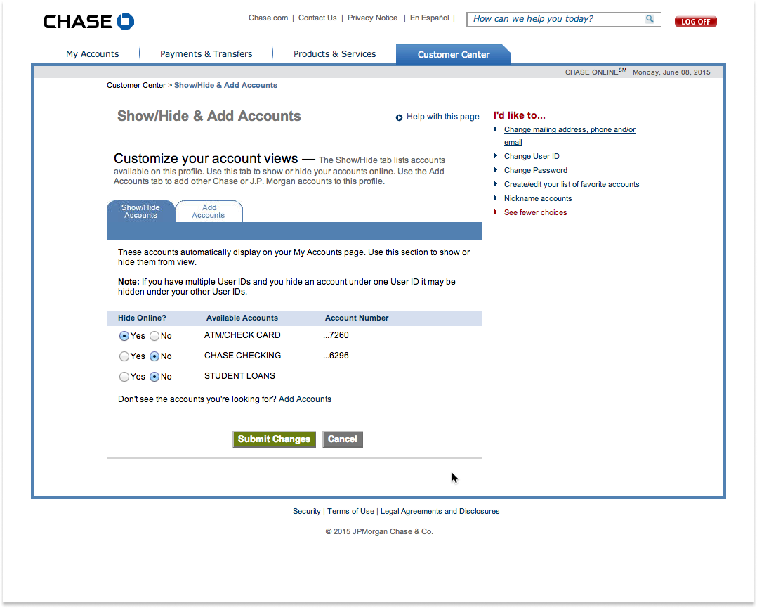
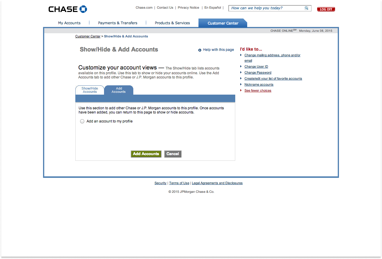
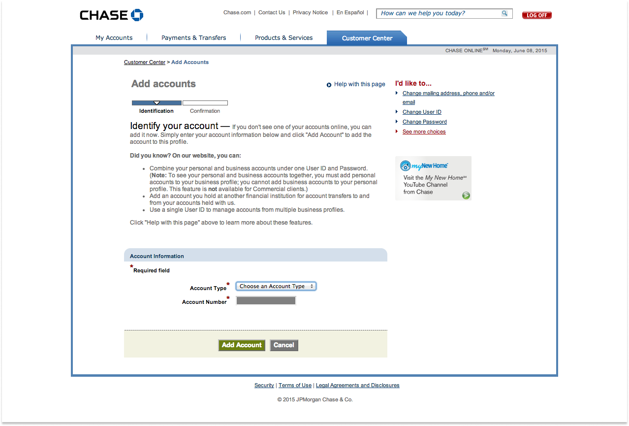
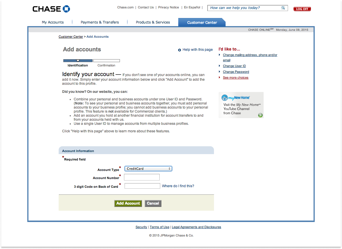
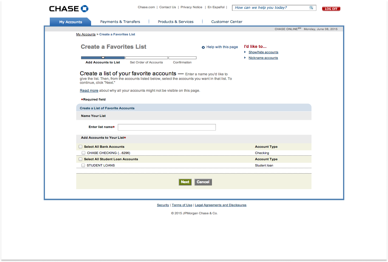
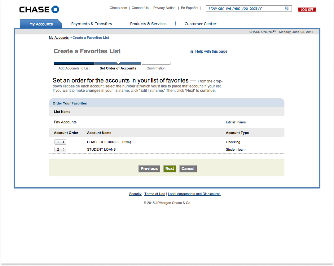
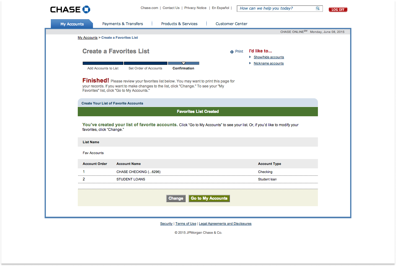
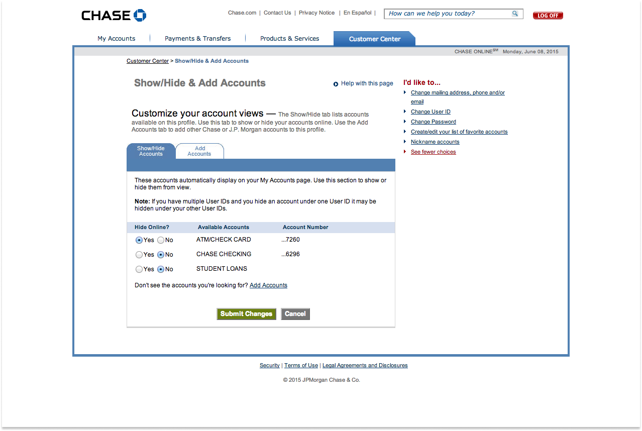
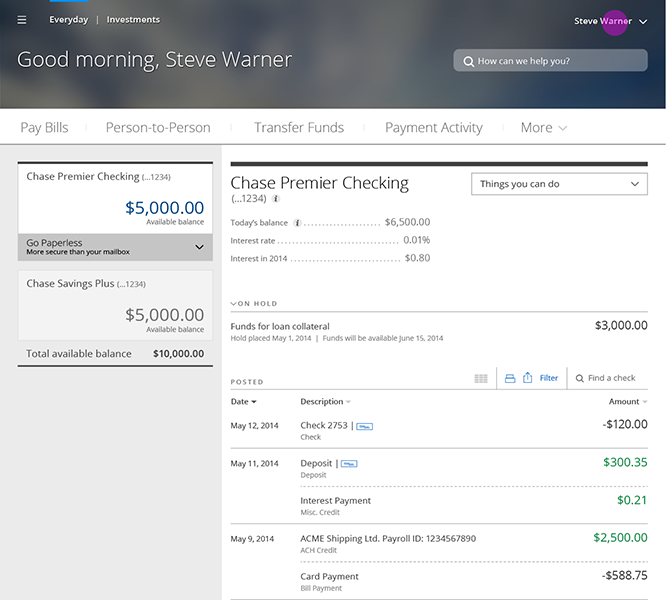
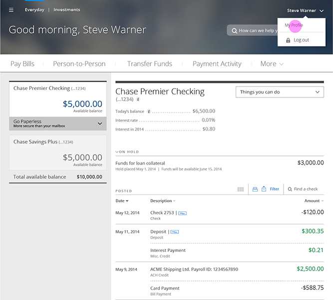
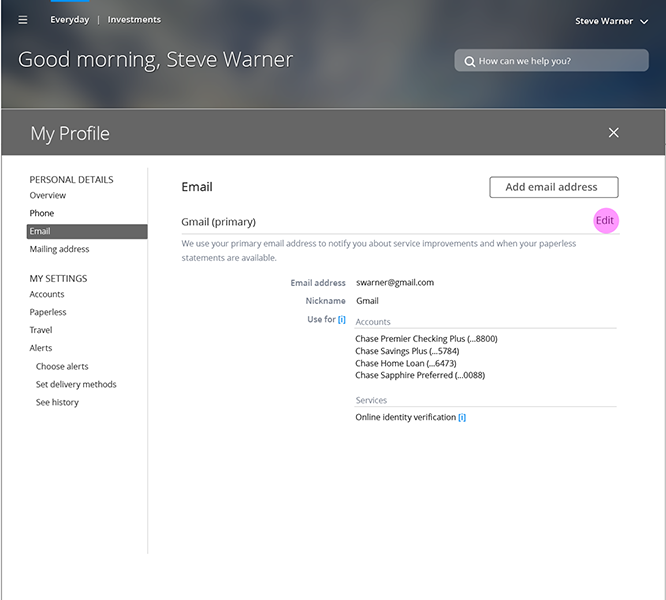
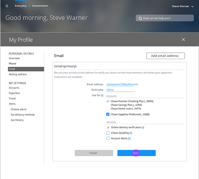
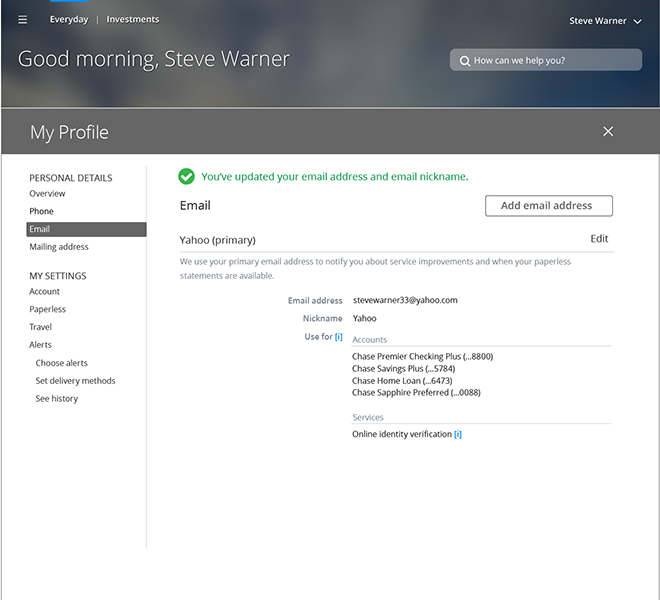
The user flow and wireframes were created to demonstrate a streamlined approach for users to update their email address within the profile section of Chase.com. The redesigned flow focused on reducing complexity and improving usability, ensuring that users could complete this task more efficiently.
THE PROBLEM
The previous design featured an overly cluttered interface that distracted users from completing their tasks. Many actions, including changing an email address, involved unnecessary steps, making the overall process cumbersome and time-consuming.
THE SOLUTION
To address these issues, I minimized the user interface by reducing visual clutter and simplifying the task flow. By consolidating essential information onto fewer screens, I was able to reduce the number of steps required to complete the process. This resulted in a more intuitive user experience, reducing the number of clicks by up to three pages in some cases, allowing users to complete tasks faster and with less friction.
4 | DESIGN SOLUTIONS
My design strategy was directly informed by the research insights, which highlighted the need for a cleaner, more intuitive user interface and a fully responsive design that worked seamlessly across all devices. We prioritized a mobile-first approach, recognizing that a growing number of users relied on smartphones to manage their banking activities. Based on feedback around personalization, we also designed customizable dashboards that allowed users to prioritize the financial information most important to them. Accessibility was another key component of our strategy, and we integrated best practices for inclusive design, ensuring that the platform met the needs of all users, regardless of their abilities.
Throughout the design process, we adopted an iterative approach, continuously validating our ideas through user testing and stakeholder feedback. This allowed us to refine the experience at each stage, ensuring the final design was not only visually modern but also functionally aligned with users’ needs and expectations.
IMAGERY
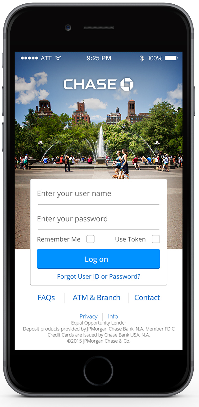
Photography plays a crucial role in visual storytelling for Chase, carefully selected to create maximum impact while communicating key brand values. The imagery should convey the attributes Chase holds in high regard—trustworthy, committed, welcoming, confident, innovative, and intelligent.
Chase photography should feel clean, natural, and authentic, capturing genuine moments from daily life, both personal and professional. The aim is to avoid overly posed or staged images, instead focusing on real interactions and authentic experiences. We steered clear of headshots, subjects looking directly at the camera, exaggerated emotions, and cold studio settings, as these can feel forced.
The visual direction emphasized vibrant and positive imagery, spotlighting the unique lifestyles of Chase’s diverse customer base. Ultimately, the photography should feel Simple, Personal, Human, and Cohesive, reflecting real-life moments that users can connect with and see themselves in.
Chase blue is a color that identifies people with Chase. It’s prominence and spirit make it the perfect way to signify activity and action that can be trusted.
R0 G146 B255
#0092FF
R11 G110 B253
#0B6EFD
R0 G146 B255
#0092FF
R18 G107 B197
#126BC5
R10 G67 B134
#0A4386
THE HOMEPAGE
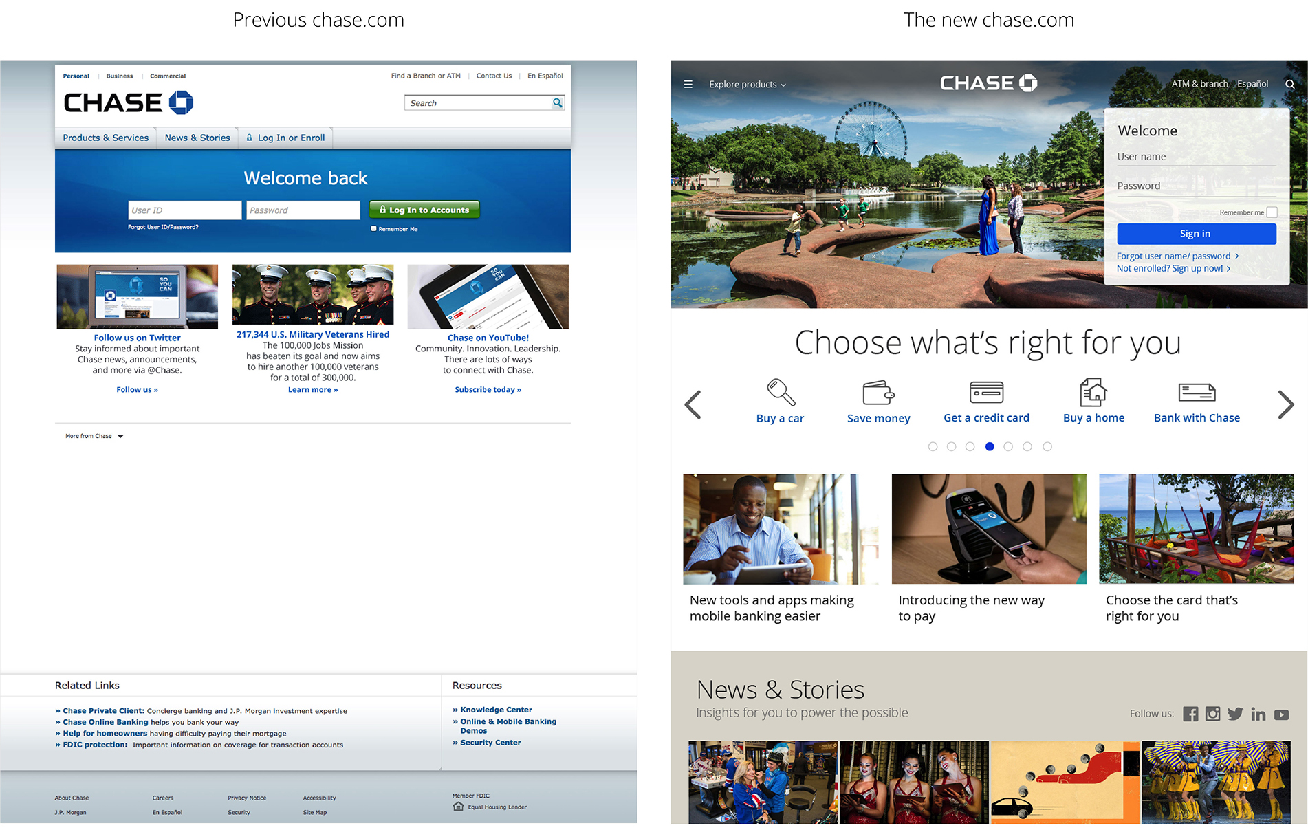
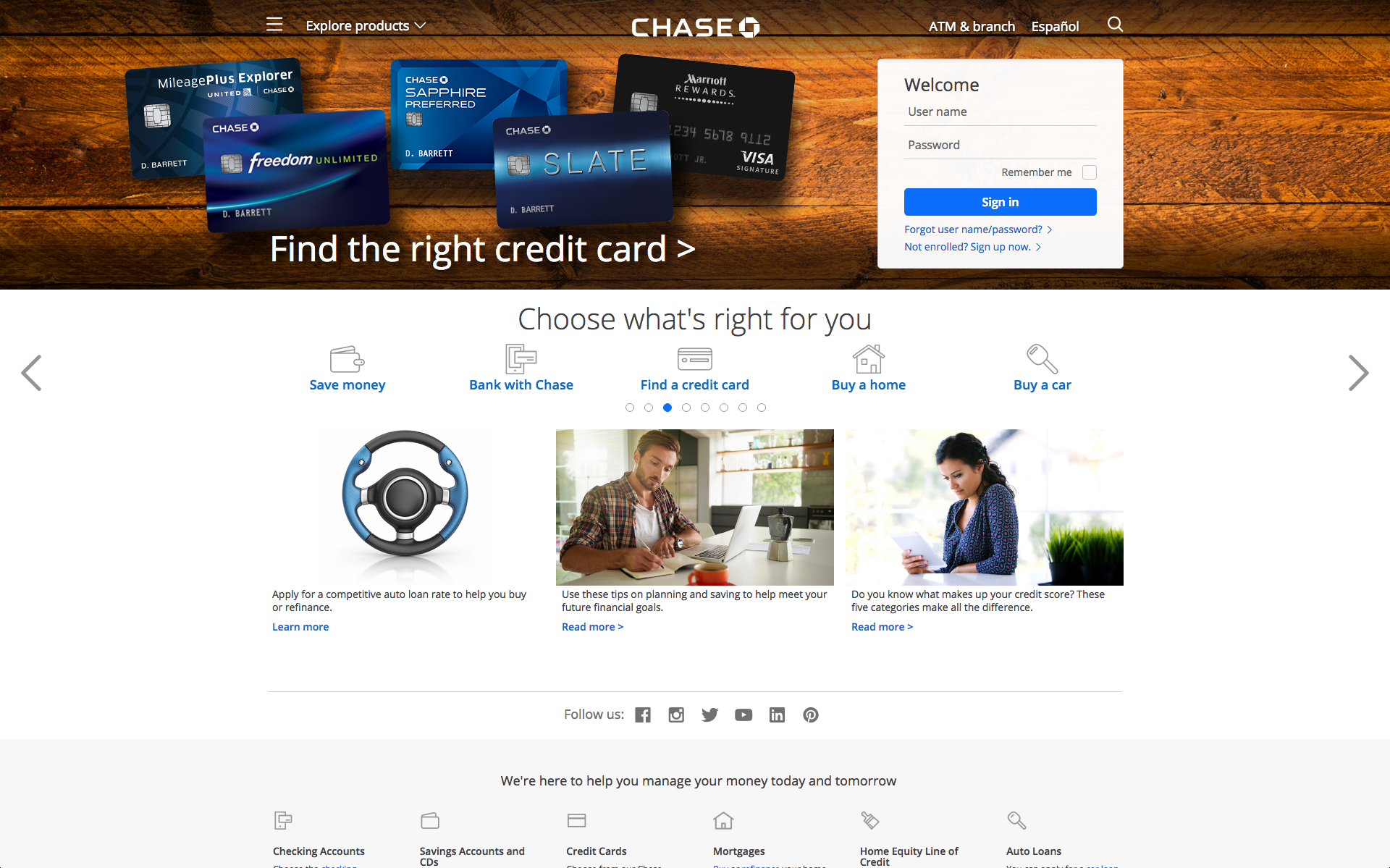
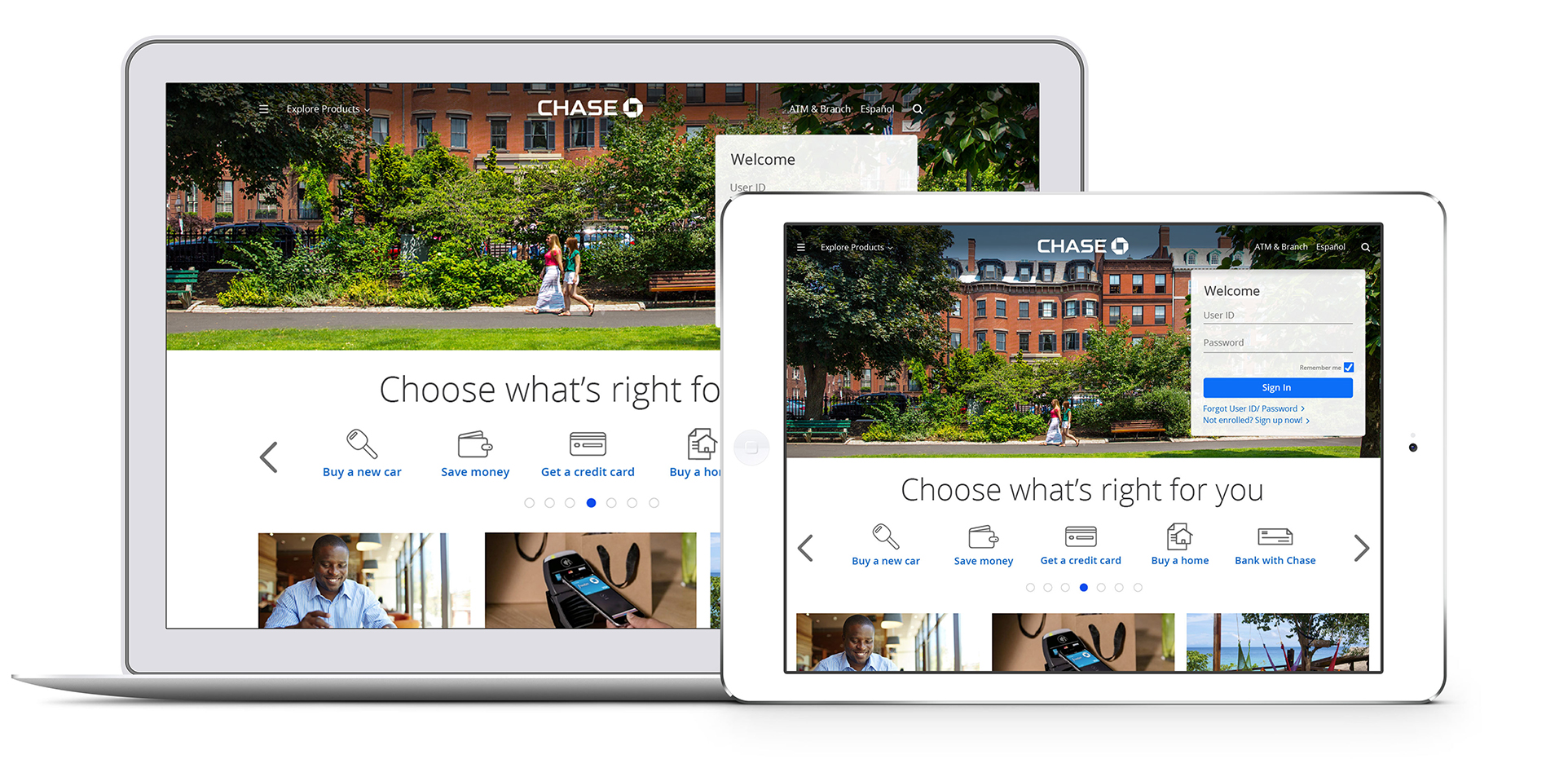
The redesigned chase.com home page is the next step in Chase’s digital transformation. It’s another step forward in showing that a bank can effectively connect with customers one-on-one, in an engaging, personal way. The launch of the new homepage design was to make it faster, simpler and more personalized for the bank’s customers. The new homepage – available in English and Spanish – uses simple navigation and modern design to make it easier for customers to find what they are looking for. This experience is consistent across desktop and tablet devices.
Here are the 5 ways the home page improved customers experience:
- Feel at home: Localized images personalize the site for returning visitors
- Take a scroll: Customers can scroll – like any newsfeed – down the home page and have access to relevant content
- Navigate with ease: The easy-access menu stays clearly in sight as customers scroll down the home page
- See the choices: Customers can find which checking accounts, credit cards or mortgages best fit their lifestyle
- Learn from both experts and customers: News & Stories’ timely advice and insights move to a more prominent place
PAYMENTS & TRANSFERS
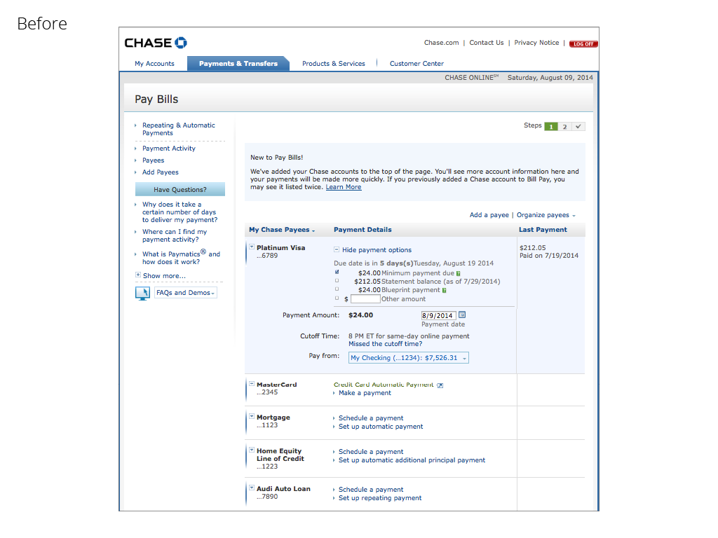
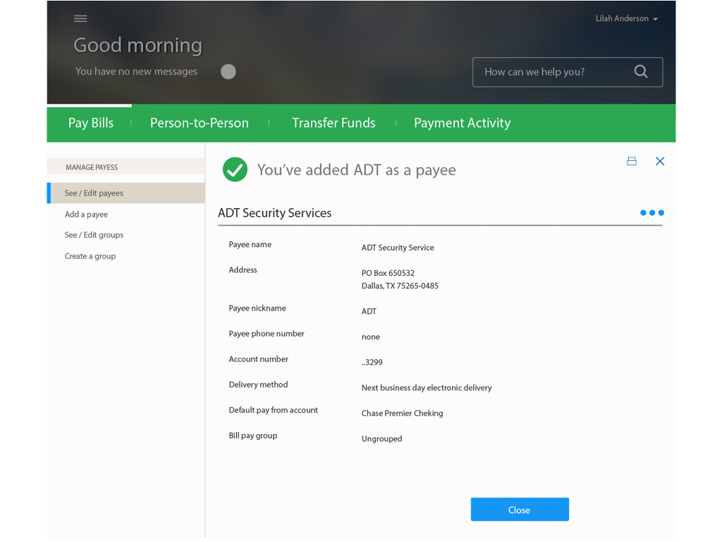
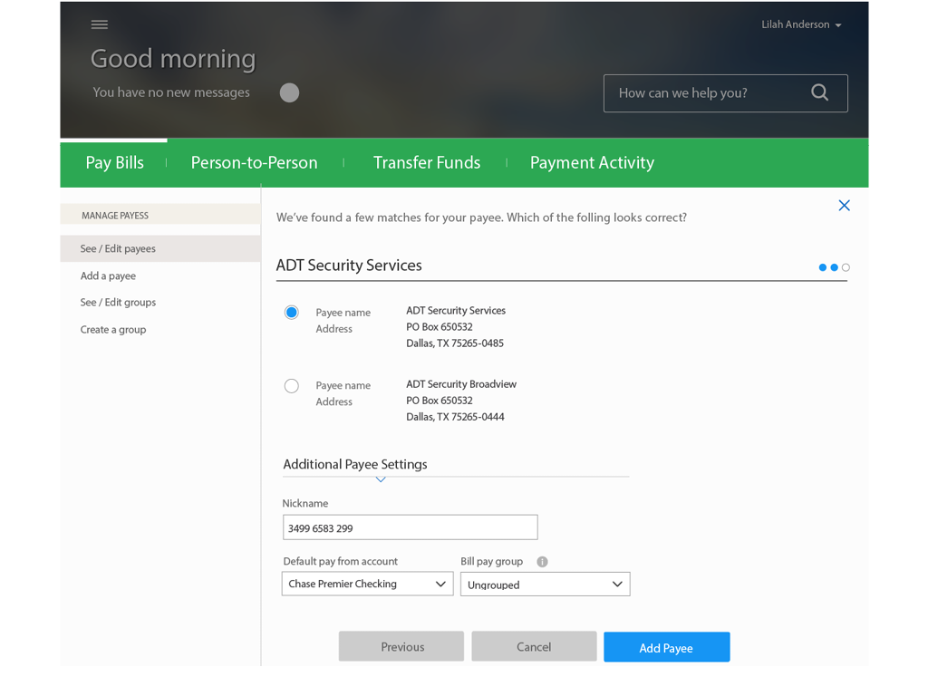
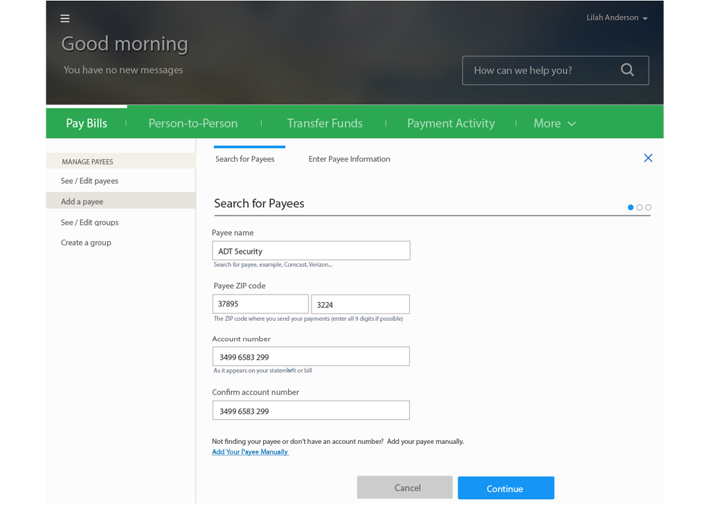
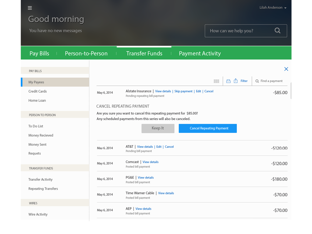
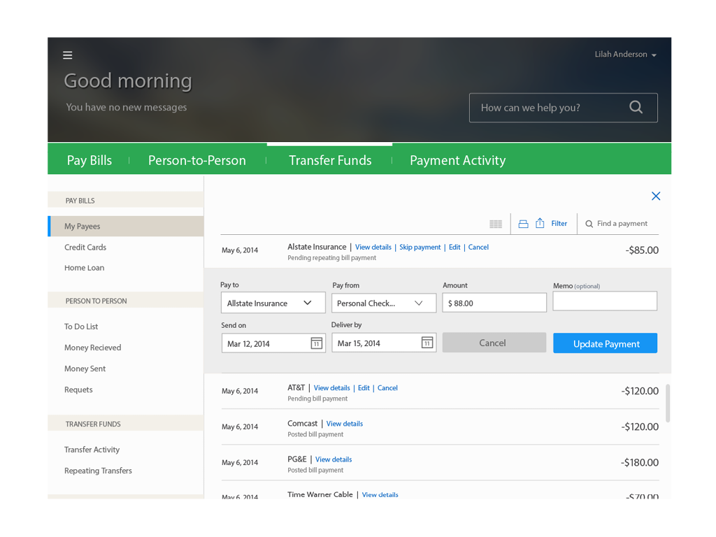
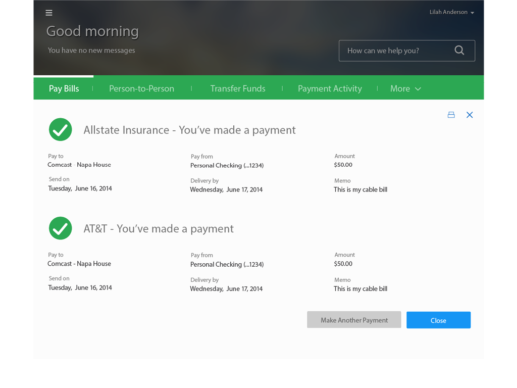
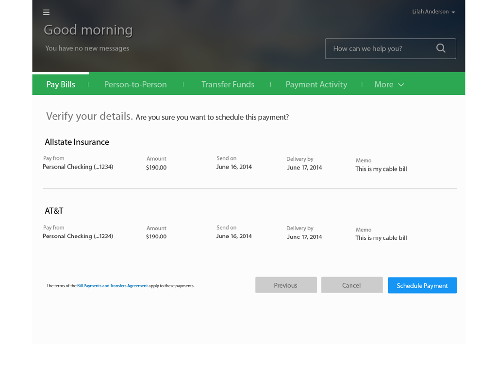
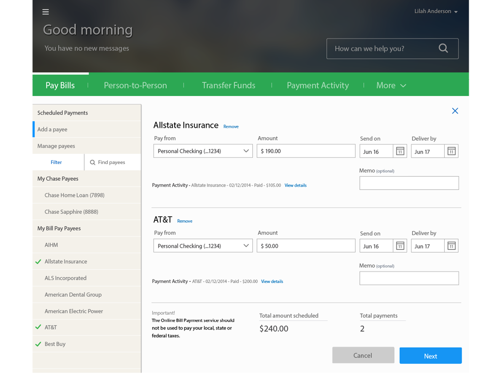
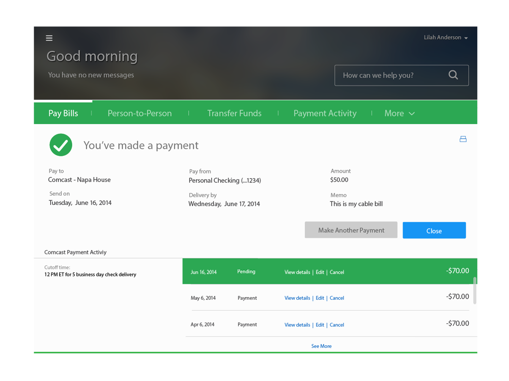
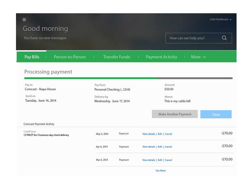
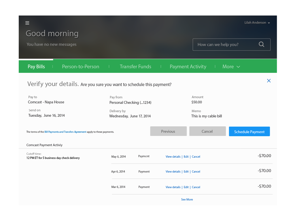
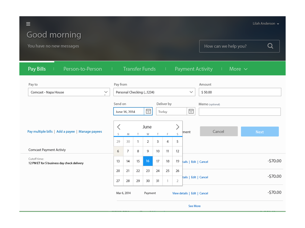
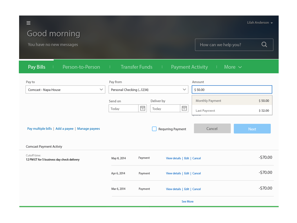
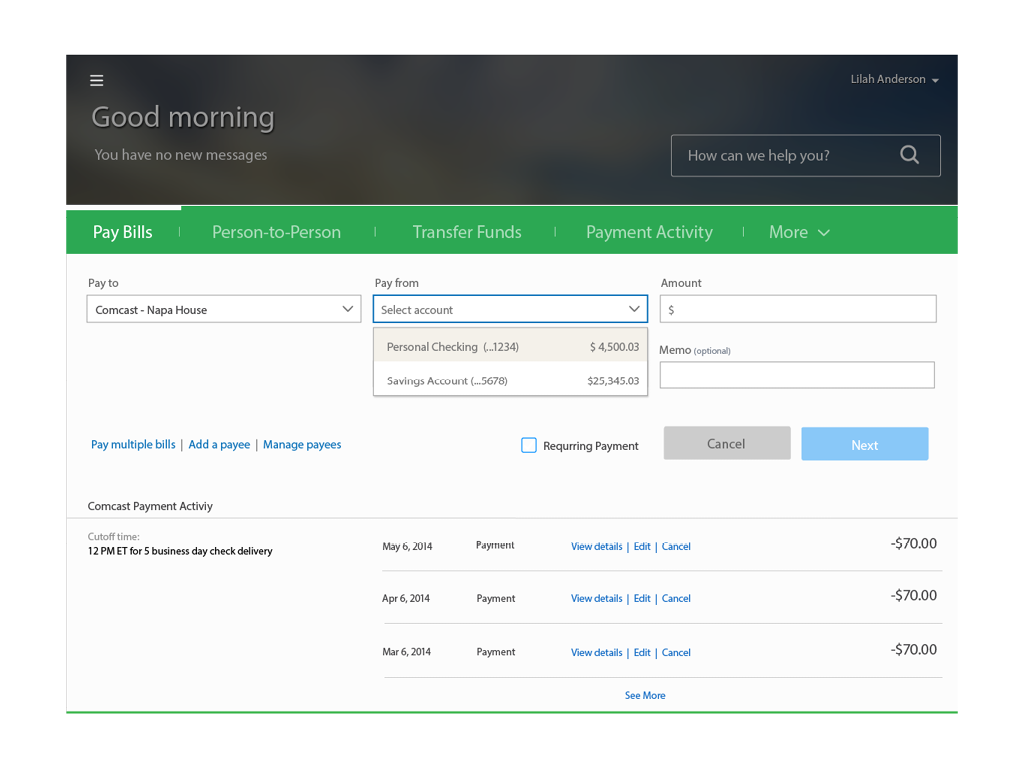
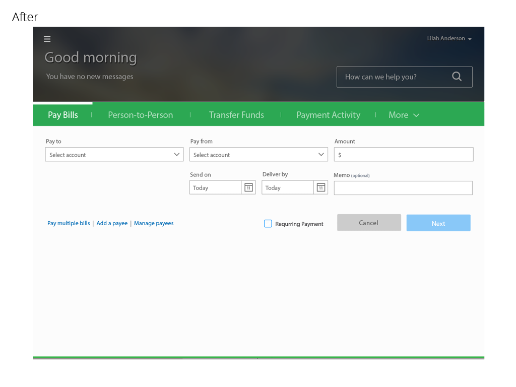
On average, Chase processes 50 million payment transactions per month through chase.com. In order to support this volume of activity, the payment experience needs to be robust, easy to use and support all of Chase’s payment products. Voice of the Customer surveys and user testing revealed that customers found previous versions of the payments experience overwhelming, required too many clicks to complete a task and weren’t optimized for smaller tablets or mobile devices. The goals of the redesign were to simplify the number of steps required to complete a task, reduce the cognitive load of the experience, support and increase transaction volumes of all payment products and be available on all device types by leveraging a responsive web framework.
As a result the redesign experience resulted in a 30% increase of transaction volume across all products. Reduced the task completion time to an average of 25 seconds to complete a one-time payment. Increased customer satisfaction scores from 55 to 83. Standardized the payment experience across all 14 payment products. My team and I received a U.S. Patent for the innovative user experience.


