Eileen Fisher Inc. is an American privately held company founded by Fisher in 1984 with $350 in startup money. Her first order at a New York clothing design show was for $3,000, which was followed three months later with $40,000 in additional sales. She opened her first retail store in 1986, on East 9th Street in Manhattan. Fisher’s company emphasizes sustainability, with 70% of the cotton used in its clothing sourced from organic cotton. In order to reduce fabric and fiber waste, the company started a recycling program. Customers donate their “gently used” Eileen Fisher clothing in return for a $5 gift certificate per article. After dry cleaning, the garments are resold—with the income funding business grants for women and leadership programs for young women.
—
MY CONTRIBUTIONS
I was tasked with designing and developing innovative solutions to enhance the usability of the company’s e-commerce site, ensuring branded customer experiences that resonate with users. This involved creating compelling interactions that elevate the overall user experience and drive engagement. I prepared comprehensive UX/design presentation decks outlining suggested site enhancements, which included wireframes, user flows, mockups, final designs, and redlines for development. These materials served as valuable tools for communicating design concepts and guiding the development process, ensuring alignment with project objectives and delivering impactful results.
—
- Strategy
- User Research
- User Interface Design
- User Experience Design
- Visual Design
- User Flows
- Branding
- Mockups
- Wireframees
- Product Design
Starting Point
I’ve had a longstanding interest in environmental causes and the impact that my choices as a consumer have on the environment, and Eileen Fisher has a history of making deep, sincere efforts to improve the ecological and ethical impact of their clothing production. Their work also interested me as part of a much more systemic problem. The fashion industry is second only to the oil industry in terms of the harm it inflicts on the planet.
Eileen Fisher has a reputation for minimal design, high-quality fabrics, and ethical environmental business practices. According to our research, the company is contending with an aging customer base and is looking to find ways to appeal to younger customers. Their social mission is integral to the consumers relationship with this brand, however, we believe there is an opportunity to attract younger consumers and spread the companies message by integrating the brand story within the e-commerce experience. As a lead on the team, I was brought in to help improve the user experience of their e-commerce website for desktop and mobile while maintaining the integrity and mission of the organization.
"We don't want sustainability to be our edge. We want it to be Universal."
01. Mobile Header & Footer Redesign
THE HEADER
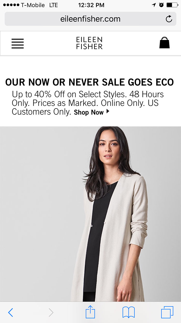
An issue emerged with the navigation of their mobile website. Essential functions crucial for user interaction were hidden within the traditional hamburger menu. Given the demographic diversity of Eileen Fisher’s clientele, which includes an older audience less familiar with modern iconography, addressing this navigation challenge became imperative. This case study delves into the problem identification, solution formulation, and implementation strategy to enhance user experience through a redesigned header.
PROBLEM IDENTIFICATION
The primary issue revolved around the placement of essential functions within the hamburger menu on Eileen Fisher’s mobile website. While the hamburger menu is a common design pattern for mobile navigation, it assumes users’ familiarity with its iconography, which may not hold true for all demographics. The older segment of Eileen Fisher’s customer base might find it challenging to locate and access crucial features hidden behind the hamburger icon, leading to frustration and potential abandonment of the site.
Old Header
SOLUTION FORMULATION
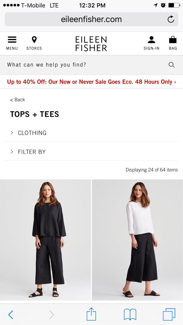
The solution entailed pulling out essential functions from the hamburger menu and integrating them directly into the redesigned header. This approach aimed to enhance user accessibility and streamline navigation, particularly for the older demographic less acquainted with modern mobile design conventions. By prominently displaying key functionalities such as search, account access, and shopping cart icons in the header, users could swiftly locate and interact with these features without relying on the hamburger menu.
New Header
THE FOOTER
Traditionally, the footer of a website has been relegated to housing less important information, overshadowed by the prominence of the header and main content. However, the rise of mobile devices has challenged this paradigm, as users increasingly scroll down to explore the footer on their smartphones and tablets. This case study explores the evolving significance of the footer in the context of mobile browsing behavior, highlighting the problem of neglecting footer space and presenting a solution for optimizing footer engagement.
PROBLEM IDENTIFICATION
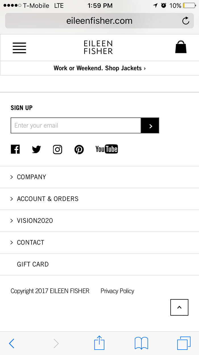
In traditional web design practices, the footer is often treated as a repository for secondary or less relevant information, receiving minimal attention from UX designers. This mindset stems from the belief that users prioritize content near the top of the page, leading to a self-fulfilling prophecy where the footer is undervalued and underutilized. However, with the proliferation of mobile devices and their unique browsing behaviors, overlooking the footer’s potential impact on user engagement becomes a critical oversight. Mobile users, facilitated by the swipe function, frequently scroll down to access the footer, challenging the assumption that bottom-of-the-page content is less relevant.
Old Footer
SOLUTION FORMULATION
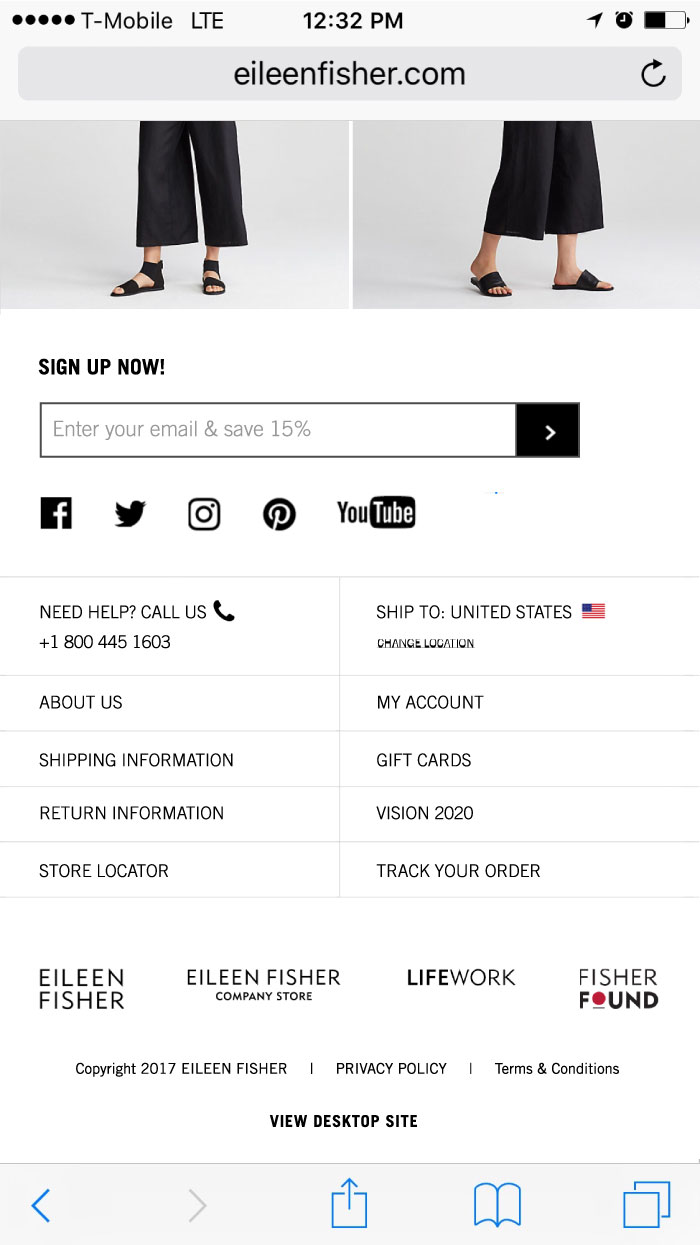
Recognizing the shifting landscape of digital customer experience, UX professionals must reevaluate the importance of footer optimization, particularly for mobile users. The solution involves applying the same principles of engagement and optimization to both the top and bottom of websites, acknowledging the increased exposure and significance of the footer in mobile browsing contexts. By prioritizing the design and content of the footer, businesses can capitalize on mobile users’ propensity to scroll down, ensuring that valuable information and calls to action are readily accessible.
New Footer
THE OUTCOME
The redesigned header and footer navigation successfully addressed the accessibility concerns associated with the hamburger menu, particularly for Eileen Fisher’s older demographic. By pulling essential functions out of the hamburger menu and integrating them into the header and footer, users could more easily locate and interact with key features, resulting in a smoother browsing and shopping experience. User feedback indicated increased satisfaction with the new navigation layout, leading to higher engagement metrics and a reduction in user frustration. Overall, the implementation of the redesigned header contributed to a significant enhancement of user experience on Eileen Fisher’s mobile website.
CONCLUSION
In the ever-evolving landscape of digital design, prioritizing user experience is paramount, especially when catering to diverse demographic segments with varying levels of technological literacy. By recognizing the challenges posed by traditional design patterns such as the hamburger menu and proactively addressing them through innovative solutions like a redesigned header, brands like Eileen Fisher can ensure that their online platforms remain accessible and user-friendly for all customers, ultimately driving engagement and loyalty in an increasingly competitive market.
02. Responsive Homepage Redesign
THE HOMEPAGE
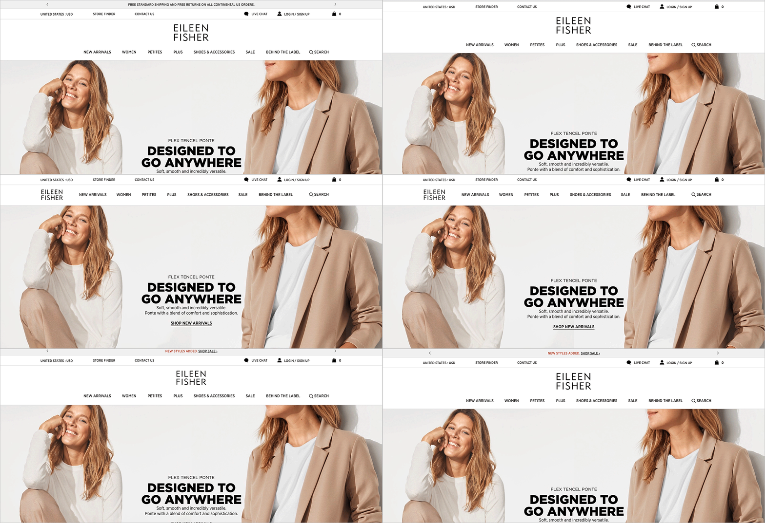
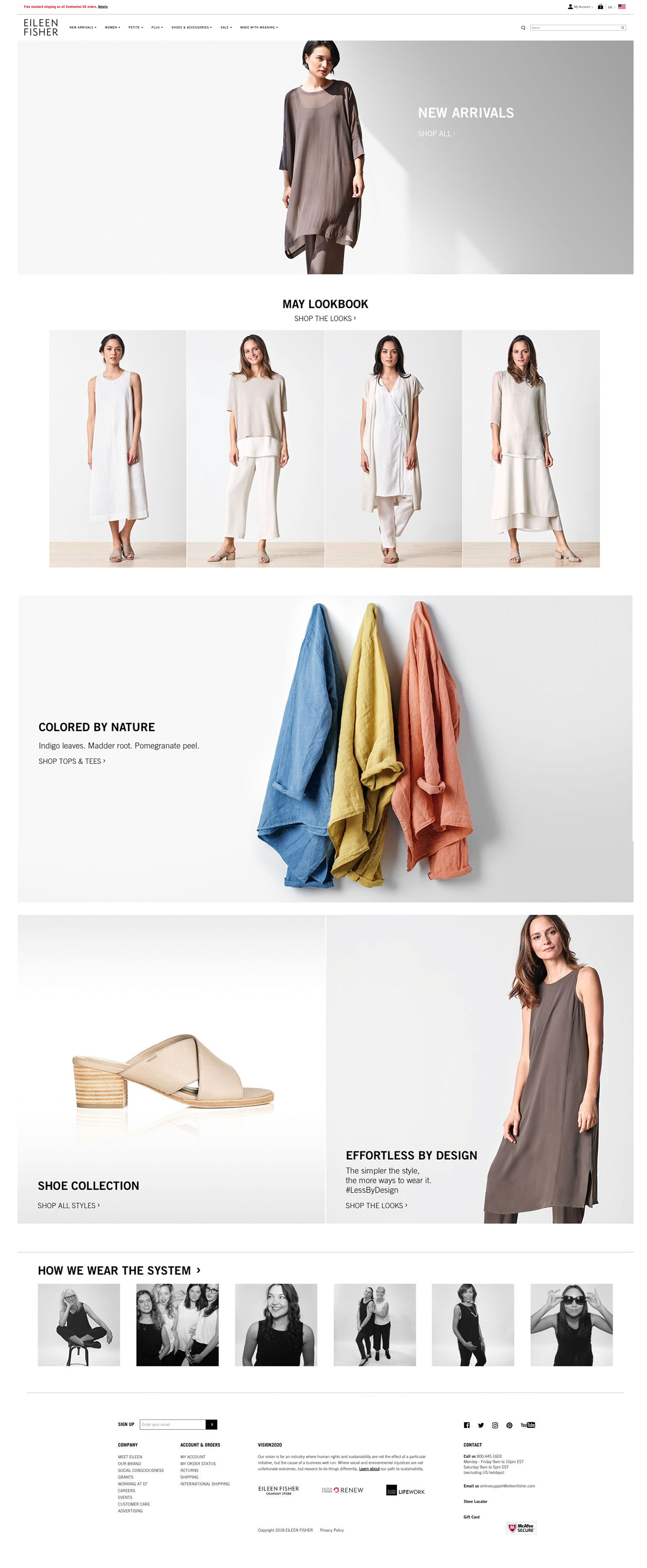
The Eileen Fisher homepage redesign project aimed to revamp the website’s interface and functionality to enhance user experience and site performance. The scope encompassed both the ecommerce platform and the integration of sustainability and give-back programs. The primary objective was to provide a refreshed, user-centric design that effectively showcased Eileen Fisher’s core products while aligning with the company’s culture and customer base.
PROBLEM IDENTIFICATION
Before diving into the redesign, I encountered a multitude of challenges plaguing the Eileen Fisher website. First and foremost, the navigation system resembled a maze, complicating the browsing experience for users and deterring them from exploring further. This complexity hindered seamless navigation, potentially leading to frustration and drop-offs.
Moreover, upon landing on the homepage, visitors were met with a lackluster visual presentation that failed to captivate their attention or effectively communicate the brand’s essence. The absence of compelling imagery and engaging content meant that potential customers weren’t enticed to delve deeper into the website or explore the brand’s offerings.
Furthermore, the existing layout suffered from a failure to optimize space, resulting in overcrowded sections that overwhelmed visitors and detracted from the overall aesthetic appeal. Cluttered elements competed for attention, making it challenging for users to focus on the key messages or products.
These issues collectively contributed to diminished user engagement and conversion rates, highlighting the urgent need for a comprehensive overhaul of the homepage design. It was evident that a strategic approach was required to address these challenges and realign the website with the brand’s goals and values, ultimately enhancing the user experience and driving better outcomes.
SOLUTION FORMULATION
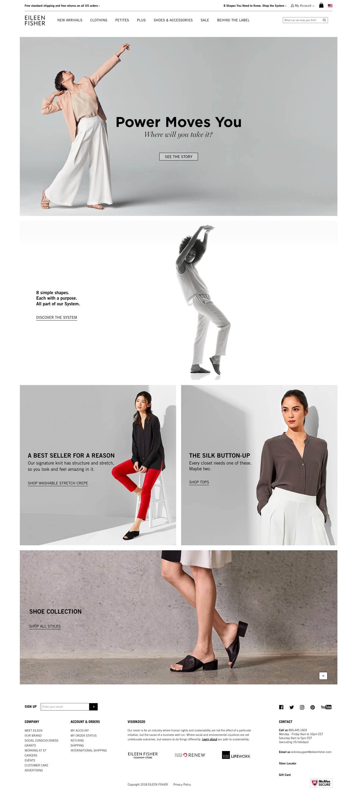
I implemented a strategic approach to address the identified challenges and achieve our project goals. Key solutions I employed included:
- Simplified Navigation: The header navigation was streamlined to improve accessibility and ease of use, enabling visitors to navigate effortlessly through the site.
- Enhanced Visual Elements: The hero image and site sections were redesigned to leverage the full width of the page, creating visually impactful layouts that showcased Eileen Fisher’s products and brand ethos effectively.
- Reflective Design: The homepage design was aligned with the company culture and customer preferences, incorporating elements that resonated with Eileen Fisher’s values and aesthetic sensibilities.
- Redesigned Footer: The footer section was revamped to enhance usability and provide users with easy access to essential information, such as contact details, social media links, and additional resources.
By implementing these solutions, the redesigned homepage aimed to offer an intuitive, visually engaging experience that captivated users and encouraged exploration of Eileen Fisher’s offerings and initiatives.
THE OUTCOME
Following the implementation of the redesigned homepage, Eileen Fisher witnessed significant improvements in user engagement metrics and site performance. The simplified navigation facilitated seamless browsing, leading to increased user satisfaction and reduced bounce rates. The enhanced visual elements effectively showcased the brand’s products and values, fostering stronger connections with customers. Moreover, the redesigned footer provided users with valuable information and resources, further enhancing the overall browsing experience. Collectively, these enhancements contributed to a more cohesive and impactful online presence for Eileen Fisher, reinforcing its position as a leader in sustainable fashion.
CONCLUSION
In conclusion, the Eileen Fisher homepage redesign project successfully achieved its objectives of improving user experience and site performance. By prioritizing simplicity, visual appeal, and alignment with the brand’s values, the redesigned homepage emerged as a cornerstone of Eileen Fisher’s online presence, driving engagement and fostering deeper connections with its audience. The project demonstrated the importance of continuous improvement and adaptation in the digital landscape, empowering Eileen Fisher to better serve its customers and advance its mission of sustainability and social responsibility.
03. Quick View Design
PROBLEM + SOLUTION
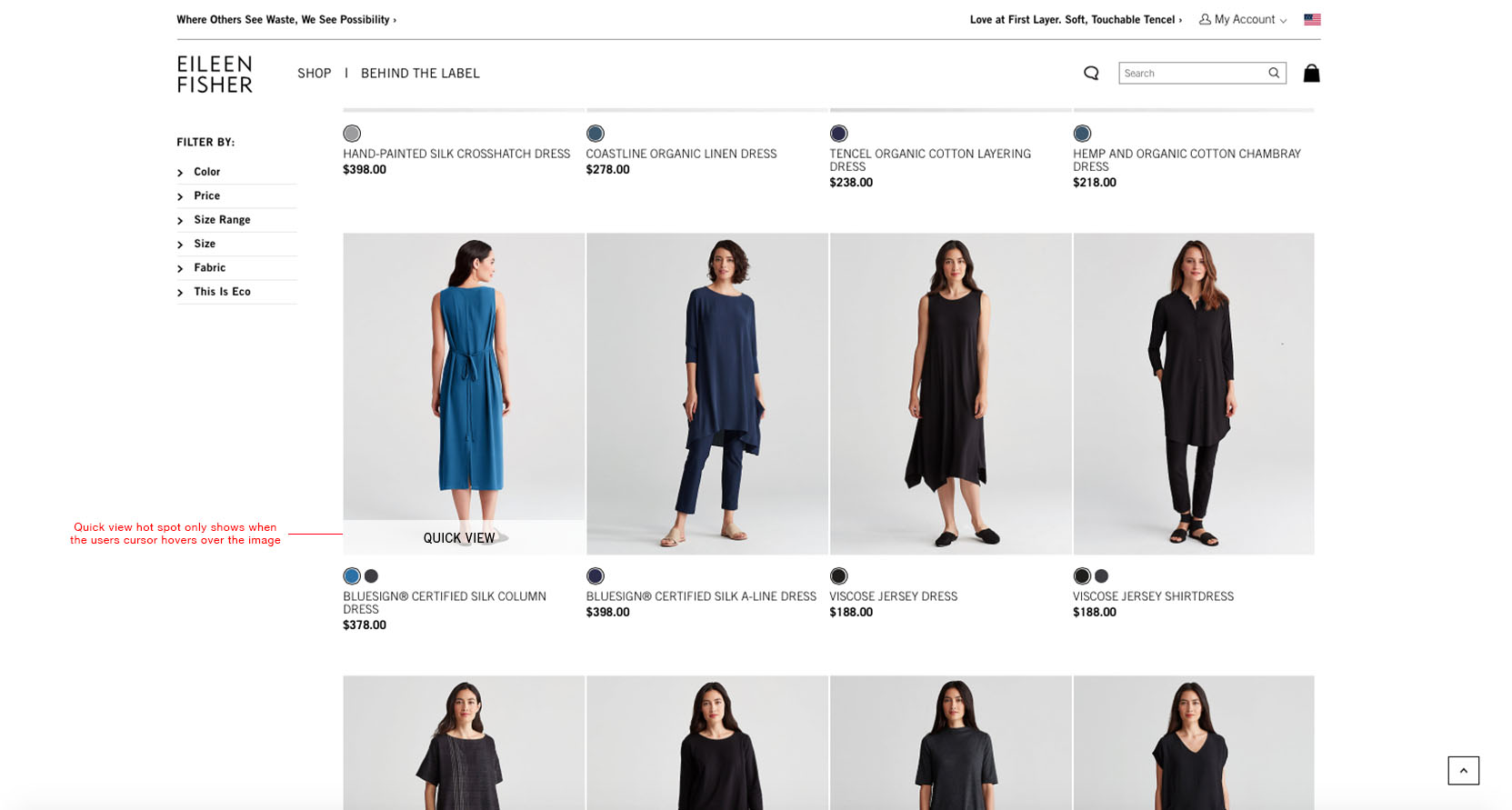
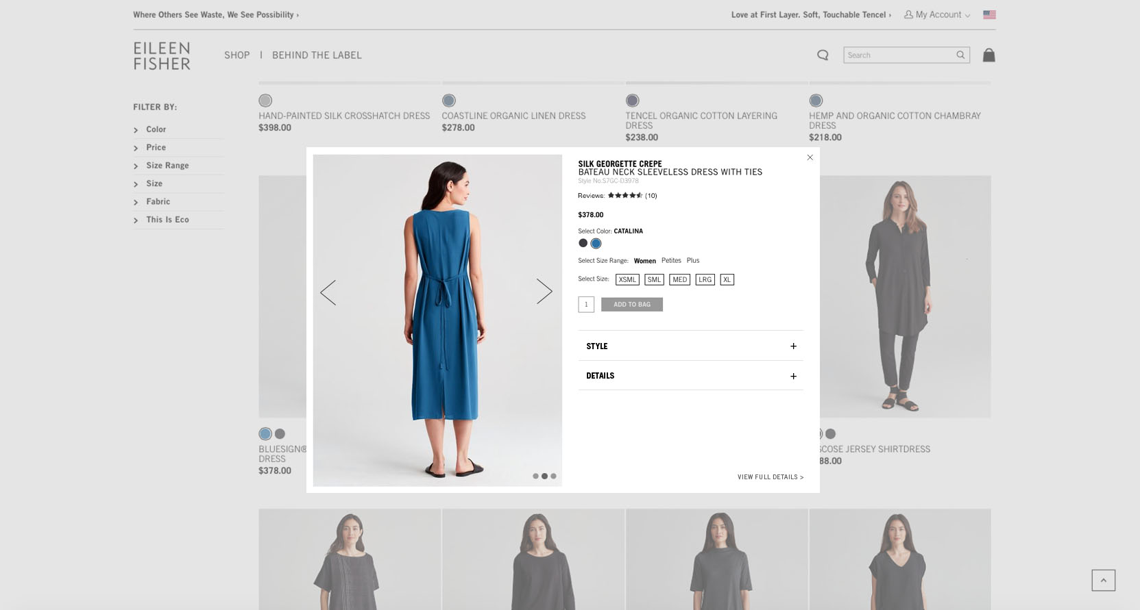
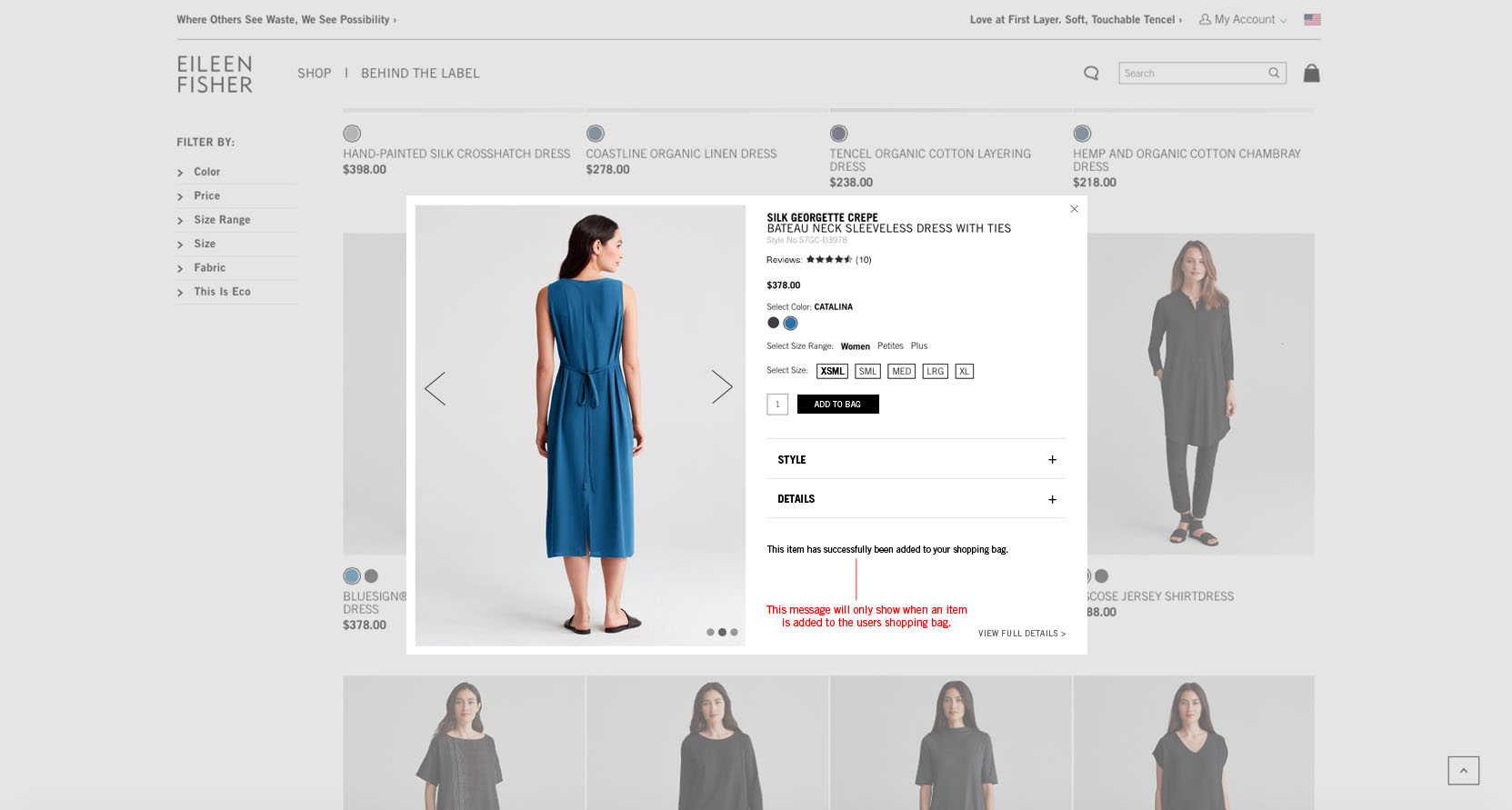
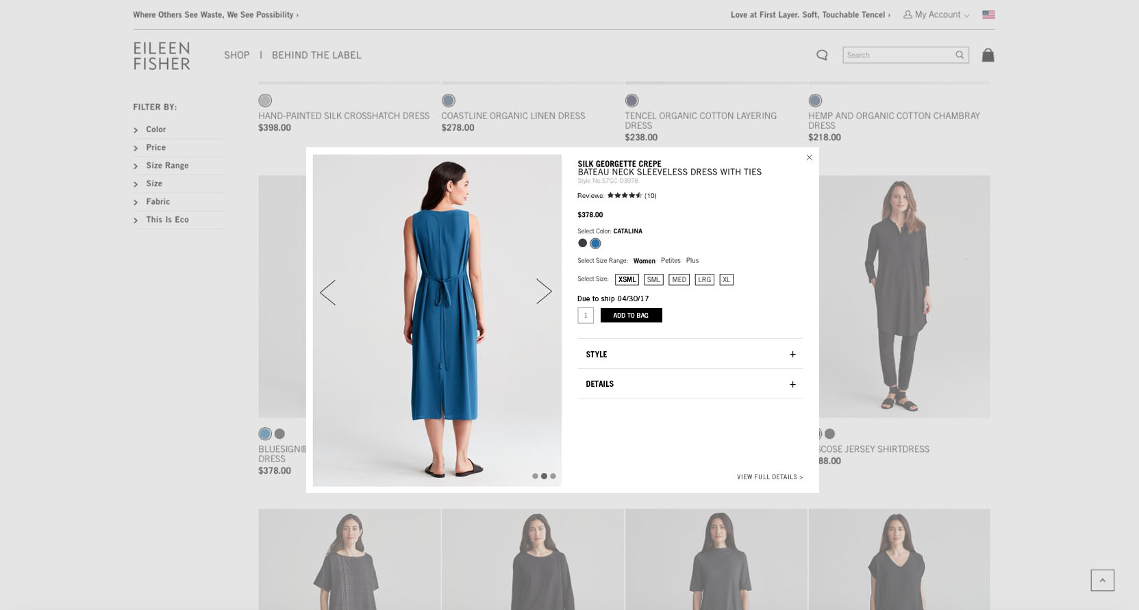
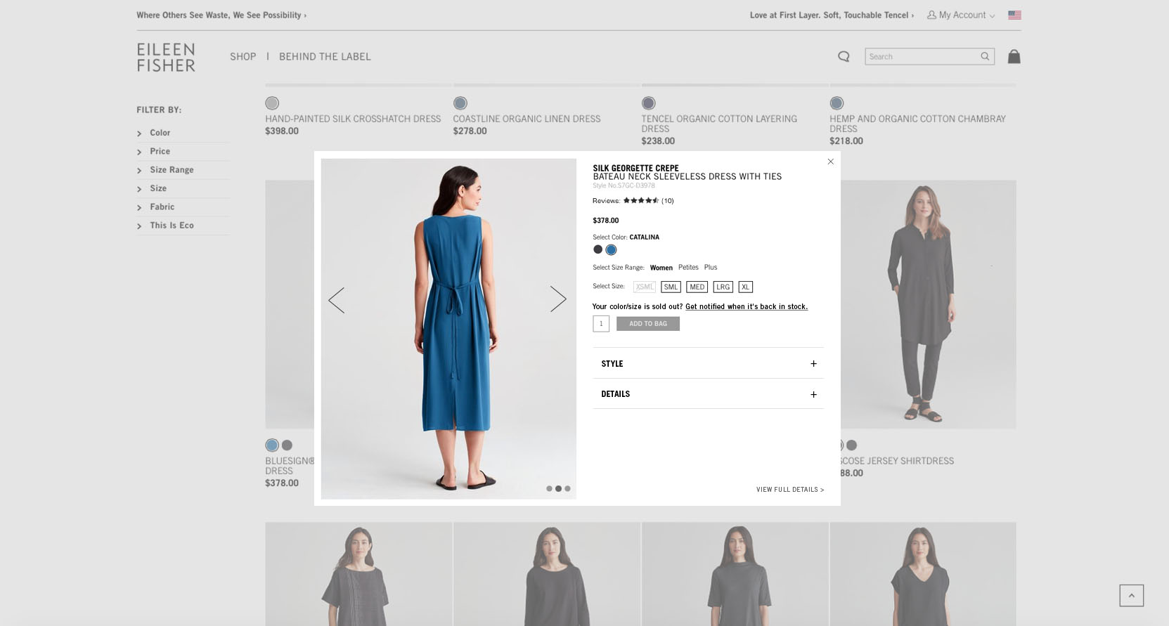
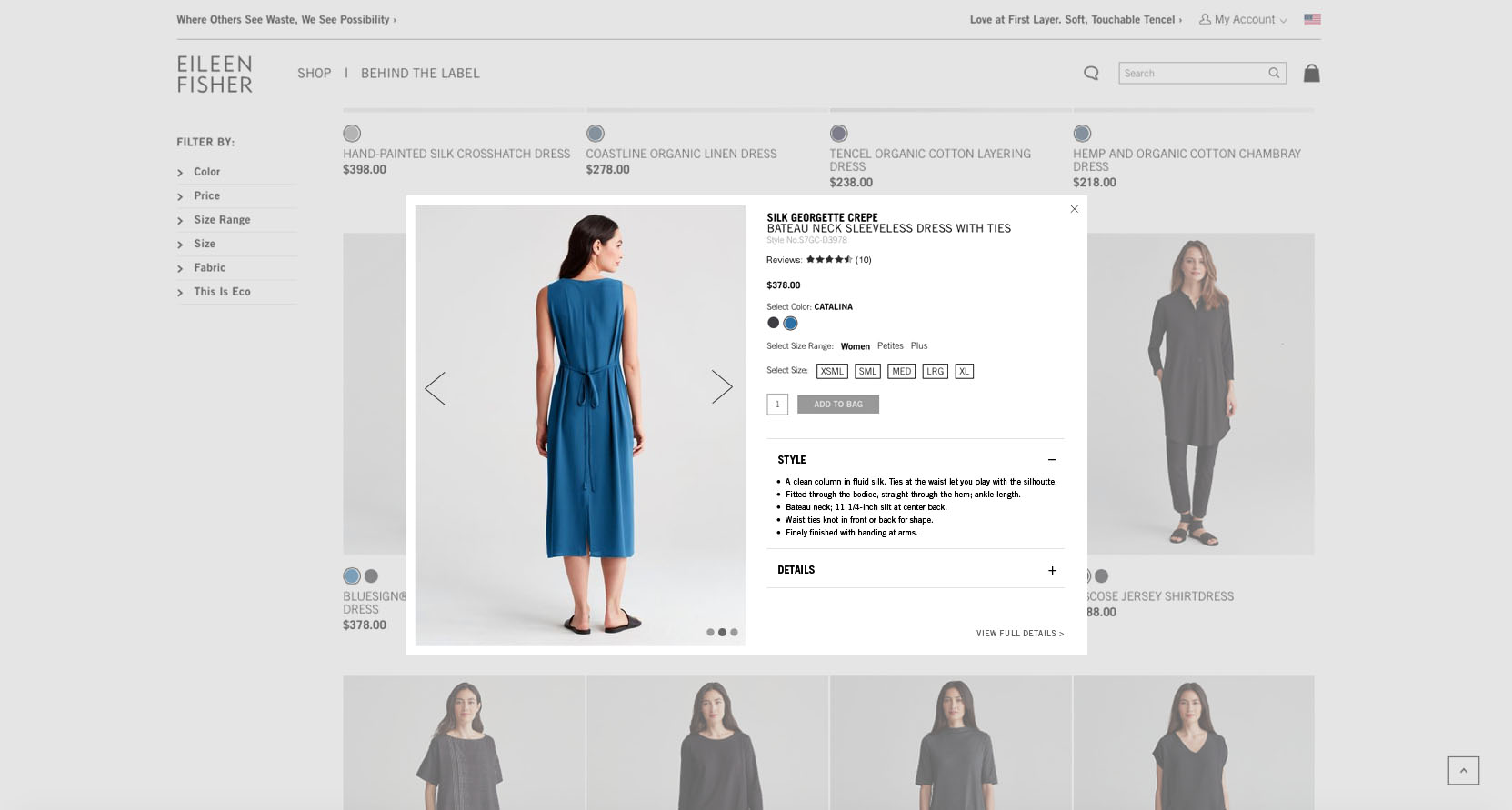
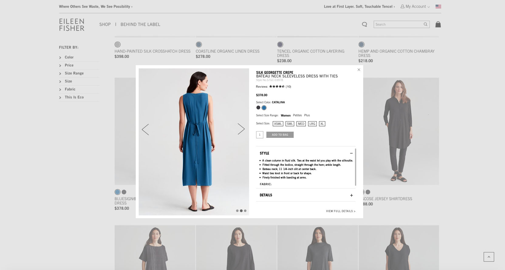
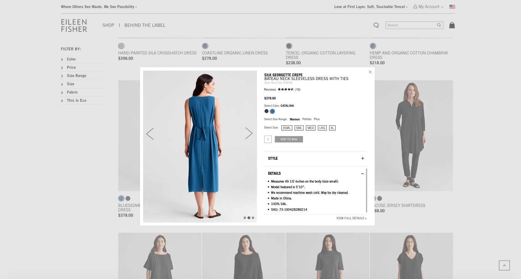
Since the inception of Eileen Fisher’s e-commerce store, the quick view functionality was not incorporated into the design or development of the site. I was tasked with researching and designing the quick view experience and user interface to make the customer’s life easier by helping them view more product details without being taken to a new page. The goal of incorporating quick view into the new site design is to increase sales by offering product details with ease. Providing the right product information at the right point for customers directly affects the companies bottom line.


