STARTING POINT
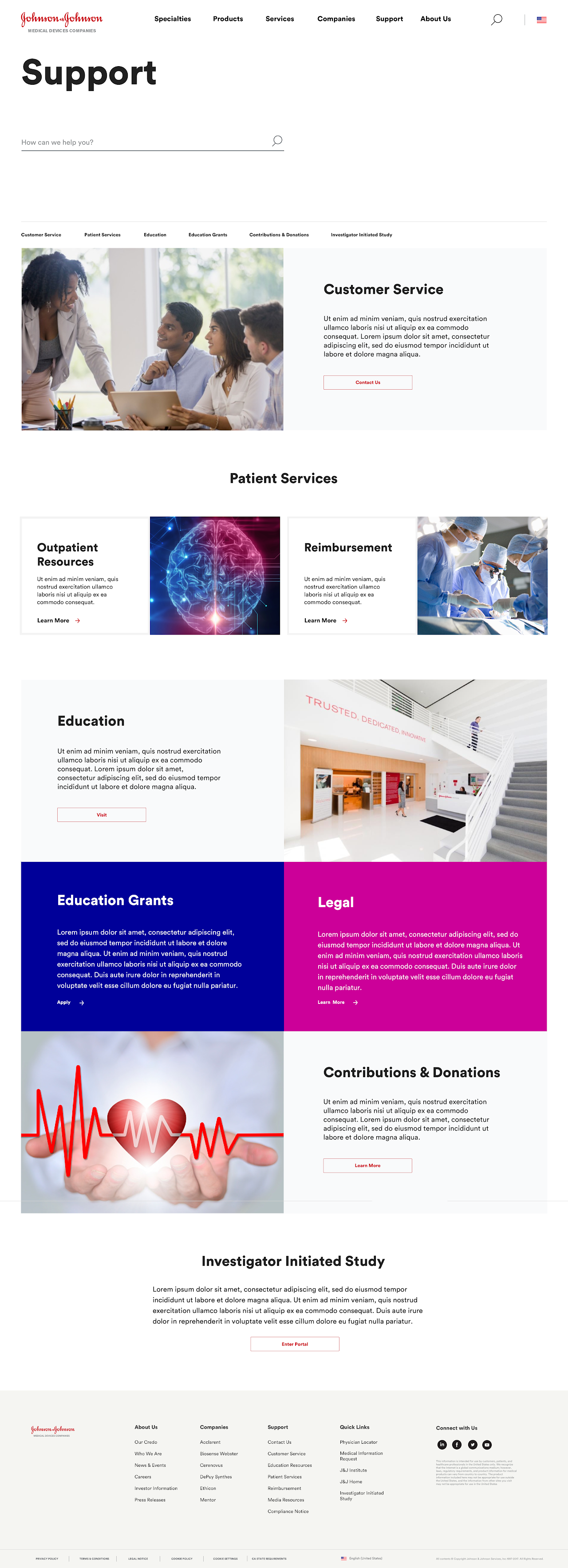
The creation of the Johnson & Johnson Medical Devices website, currently known as, Johnson & Johnson MedTech, was a monumental project, aimed at consolidating several dozen disparate websites from six separate medical device companies into a single, unified platform. This new website was designed from the ground up to reflect the new J&J brand while delivering a streamlined and cohesive user experience for healthcare professionals. Our team was tasked with ensuring that this platform provided a central hub for surgeons, physicians, and healthcare administrators to access critical medical device information with ease and efficiency.
Reconnecting the meaning of Health & Care
Position
Senior Visual Interaction Designer
Year
2017 — 2018
Services
Visual Design
UI/UX
Research
User Testing
Tools
Sketch
Adobe CC
Microsoft Office
Jira
The Problem
Johnson & Johnson’s medical device division was out of compliance with government regulations due to the existence of too many fragmented websites globally, each representing different companies under its MedTech umbrella. These disparate sites lacked a unified structure, resulting in inconsistencies in design, content delivery, and user experience. Healthcare professionals struggled to find cohesive, reliable information about the medical devices they were using on their patients, often having to navigate multiple platforms to gather necessary resources. This disjointed approach not only led to confusion and inefficiencies but also hindered J&J’s ability to effectively showcase its leadership in medical innovation and maintain a consistent global brand identity.
The Solution
Create a website with a comprehensive, user-centric platform that streamlines all major J&J Medical Device companies into one cohesive digital experience. We collaborated closely with content stakeholders and healthcare professionals to ensure that the information architecture addressed the specific needs of J&J’s target audience; primarily surgeons, physicians, and healthcare administrators. By conducting exhaustive content audits and restructuring the vast amount of information, we designed an intuitive and scalable solution that allowed users to easily access product information, research, and resources. The site featured tailored user journeys, a dynamic content delivery system, and a mobile-optimized interface, offering seamless navigation and a consistent brand experience.
Key Contributions
User-Centered Design: Developed tailored user journeys based on feedback from healthcare professionals, ensuring that the platform addressed the distinct needs of surgeons, physicians, and healthcare administrators.
Scalable & Responsive Framework: Designed a dynamic platform that was future-ready, allowing for the continuous addition of new content and innovations in line with J&J’s evolving product offerings.
Brand Cohesion & Visual Identity: Unified the visual and functional aspects of J&J’s medical device brands under a single cohesive platform, reinforcing Johnson & Johnson’s leadership in medical technology.
01 | CHALLENGES
Building a comprehensive website from scratch meant we had to first tackle the complexity of integrating diverse content from various medical device companies. Each company had its own distinct web presence, and the content spread across these sites was often inconsistent, disorganized, and overwhelming for users to navigate. In addition, each audience group—whether surgeons, orthopedists, or healthcare administrators—had unique needs, preferences, and workflows.
This new platform we embarked on creating needed to cater to a broad and specialized user base, while also remaining adaptable for future innovations and updates. The task ahead was to build a solution that was not only functional and intuitive but also scalable and aligned with J&J’s evolving brand identity.
02 | STRATEGY & APPROACH
Our approach was grounded in a user-first design philosophy. We began by conducting exhaustive content audits, collaborating closely with internal content stakeholders from the six medical device companies. Together, we embarked on a process of content categorization, refining the structure to remove redundancies and ensure clarity. This phase involved rigorous discussions and consultations, both with content creators and subject matter experts, to guarantee that all content was accurate, relevant, and user-friendly.
In parallel, we engaged with healthcare professionals who would be the primary users of this platform. Through in-depth interviews and feedback sessions, we gathered valuable insights into their specific pain points, workflows, and expectations. These sessions enabled us to better understand how medical professionals interact with digital platforms and what they require to make informed decisions in a fast-paced clinical environment.
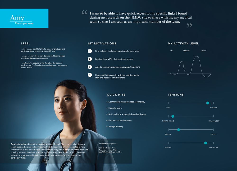
We meticulously developed HCP personas from our extensive research as representative profiles of our target users. Encapsulating their key characteristics, behaviors, goals, and pain points. These personas served as vivid, relatable representations of our diverse user base, allowing stakeholders to empathize with and understand the needs, preferences, and challenges of our users.
By embodying these personas, stakeholders could more easily grasp the intricacies of user requirements, facilitating more informed decision-making throughout the design and development process. Additionally, personas helped align internal teams around a common understanding of user needs, fostering collaboration and ensuring that design solutions were tailored to effectively address the needs of our target audience.
Furthermore, personas provided a valuable reference point for ongoing discussions and decision-making, enabling stakeholders to continually prioritize features, enhancements, and initiatives that would have the greatest impact on user satisfaction and engagement.
Overall, the use of personas played a pivotal role in bridging the gap between internal stakeholders and the user base, ensuring that our solutions were grounded in user-centric insights and ultimately driving the success of our project.
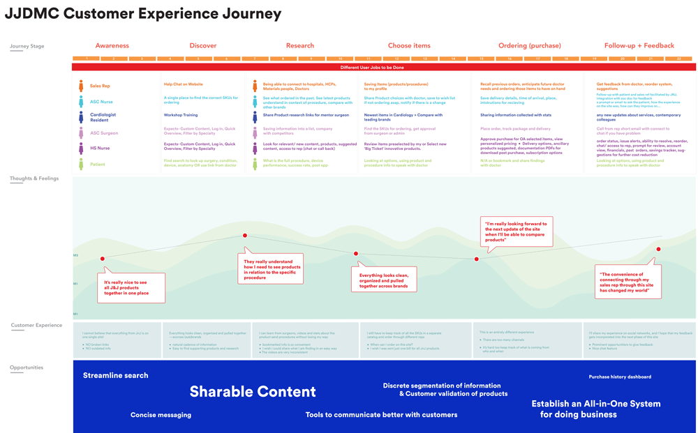
Once we gathered this data, we moved into the design phase, where we developed user journeys to map out key interactions. These insights informed the design of workflows, navigation structures, and content delivery mechanisms, ensuring the platform was intuitive and efficient.
Initially, our focus was on understanding the ecosystem, which featured dense and disorganized content. Collaborating with content owners, we conducted audits and developed a new taxonomy to gain clarity on the existing content landscape.
Subsequently, we collaborated with medical device experts to grasp the objectives healthcare professionals aim to achieve when visiting a site of this nature.
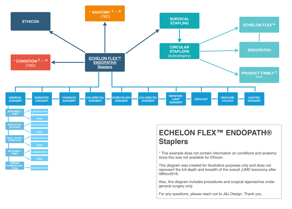
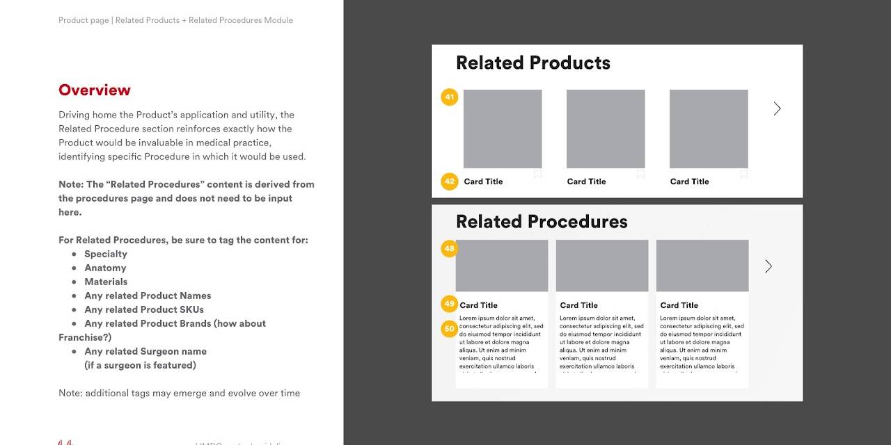
We conducted a comprehensive audit of the existing content, meticulously assessing its quantity, quality, and organization. Subsequently, we embarked on developing a new taxonomy, which involved categorizing and labeling content in a logical and intuitive manner to improve navigation and discoverability.
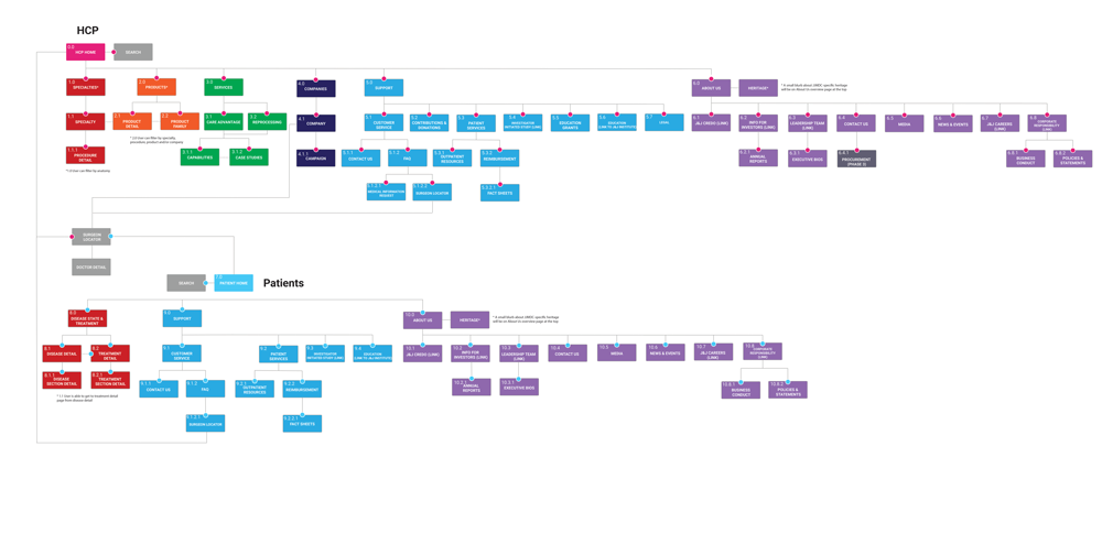
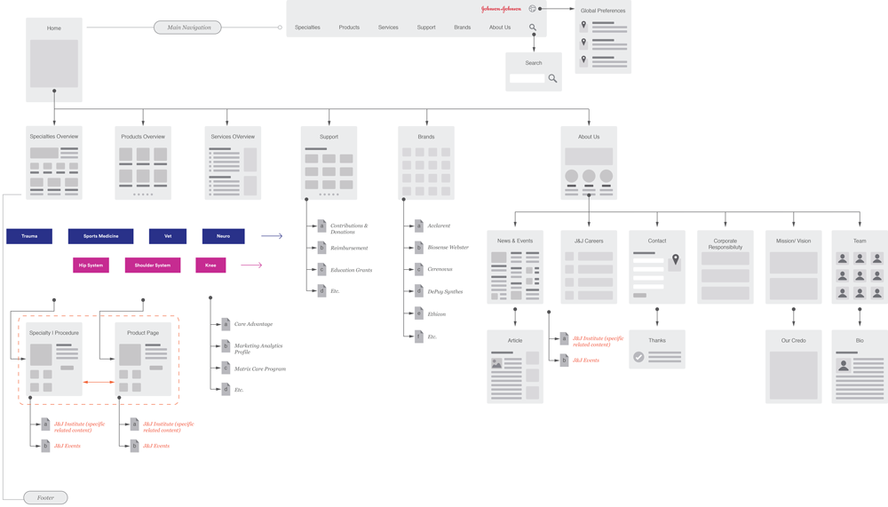
With the new taxonomy in place, we established a fresh site structure, outlining the hierarchy and relationships between different sections and pages. This structure was meticulously designed to streamline user navigation and ensure that content was easily accessible and logically organized.
Furthermore, we mapped out our various content types and categories within this new site structure, ensuring that each piece of content found its rightful place. This mapping exercise helped us identify any gaps or redundancies in our content strategy and allowed us to optimize the user experience by aligning content more closely with user needs and preferences.
By undertaking these steps, we laid a solid foundation for our content management efforts, facilitating efficient content creation, organization, and maintenance while enhancing the overall usability and effectiveness of the website.
03 | DESIGN & EXECUTION
With the groundwork laid, we focused on the execution of the site’s design. Key aspects of this process included:
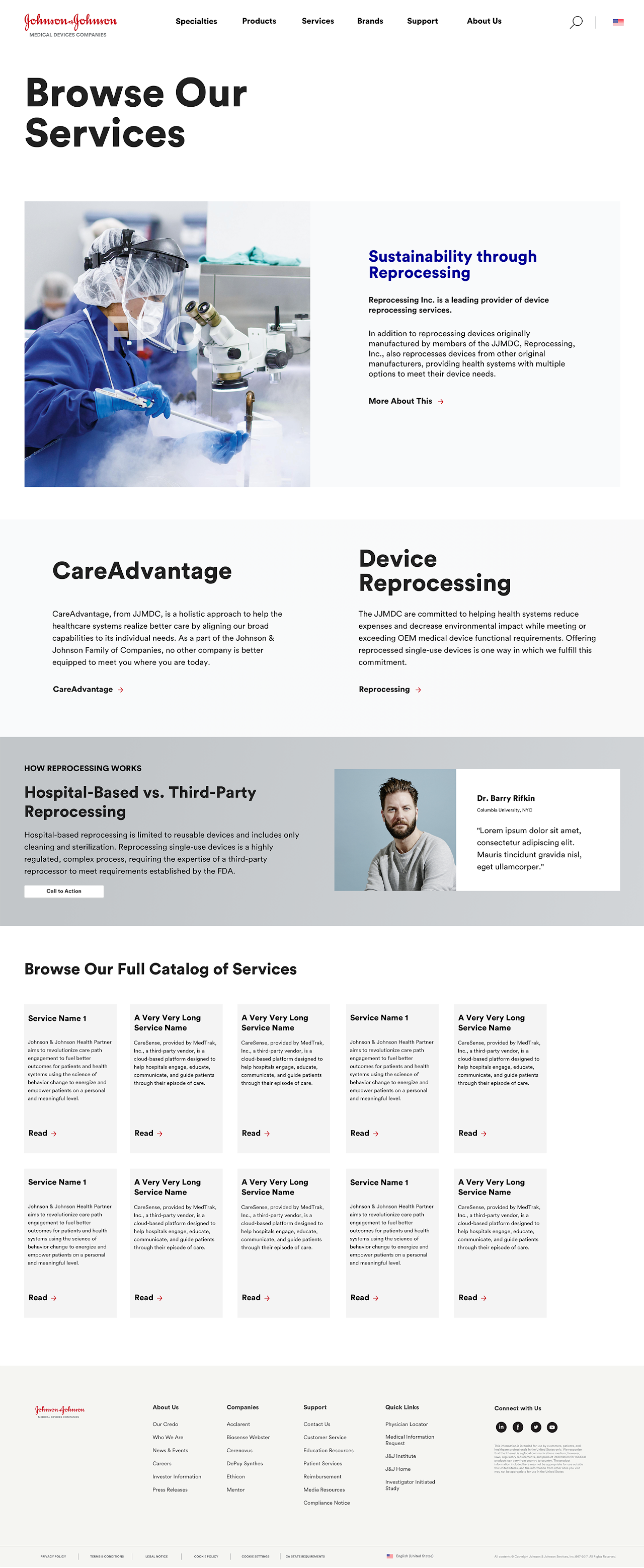
- Content Organization: The vast amount of information that had previously been spread across 250 sites was consolidated into an intuitive structure. Users could now easily find relevant products, research, and resources related to medical devices, reducing the friction of navigating multiple sites.
- Tailored User Journeys: By developing user personas for different types of healthcare professionals, we created custom pathways through the site. This allowed users such as surgeons and healthcare administrators to find exactly what they needed without being bombarded by irrelevant information.
- Dynamic and Scalable Design: Knowing that the site would need to adapt to future content and innovations, we built a dynamic framework that could easily scale. This meant not only adding new content but also adjusting for potential shifts in J&J’s product offerings or medical innovations.
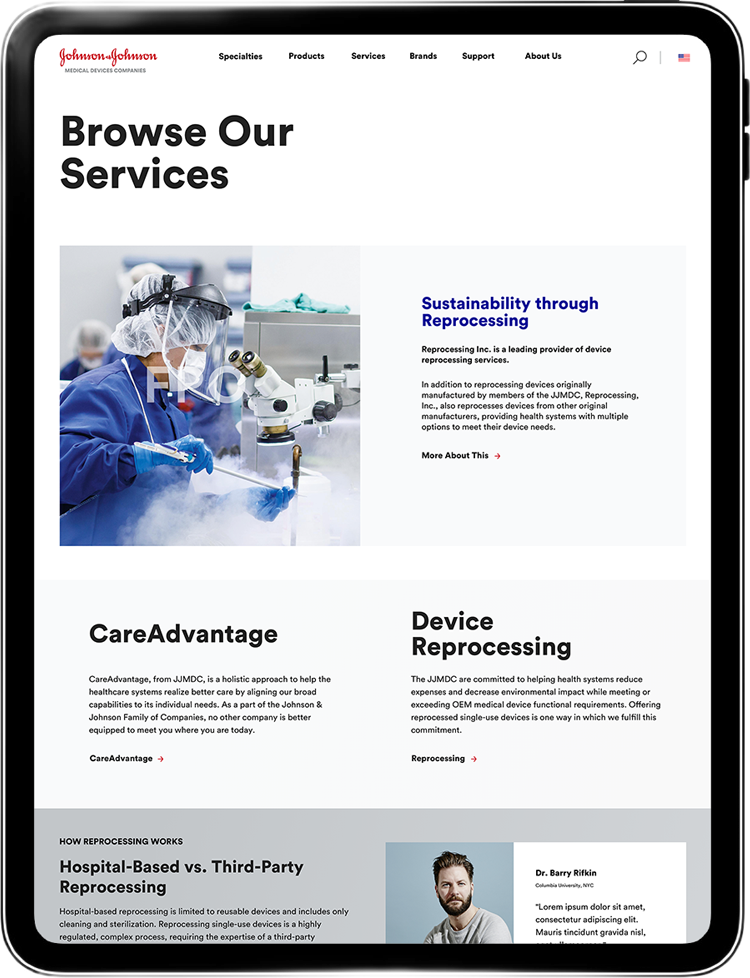
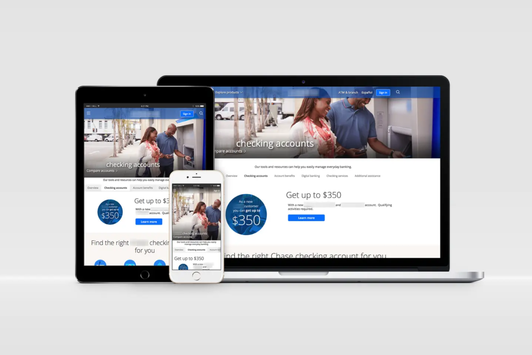
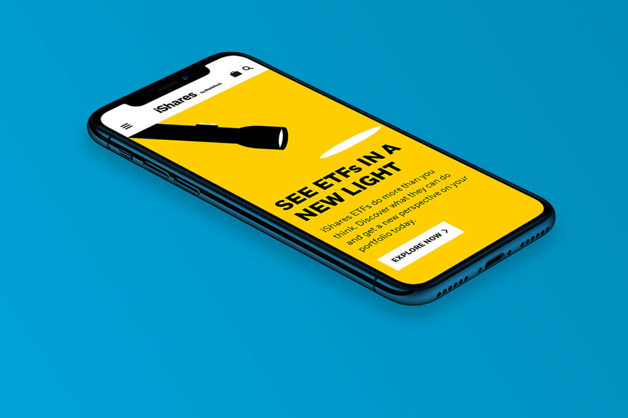
- Mobile-Optimized Platform: Healthcare professionals often access information on-the-go, so mobile responsiveness was critical. We ensured that the platform delivered a seamless experience on tablets and smartphones, optimizing performance and usability across devices.
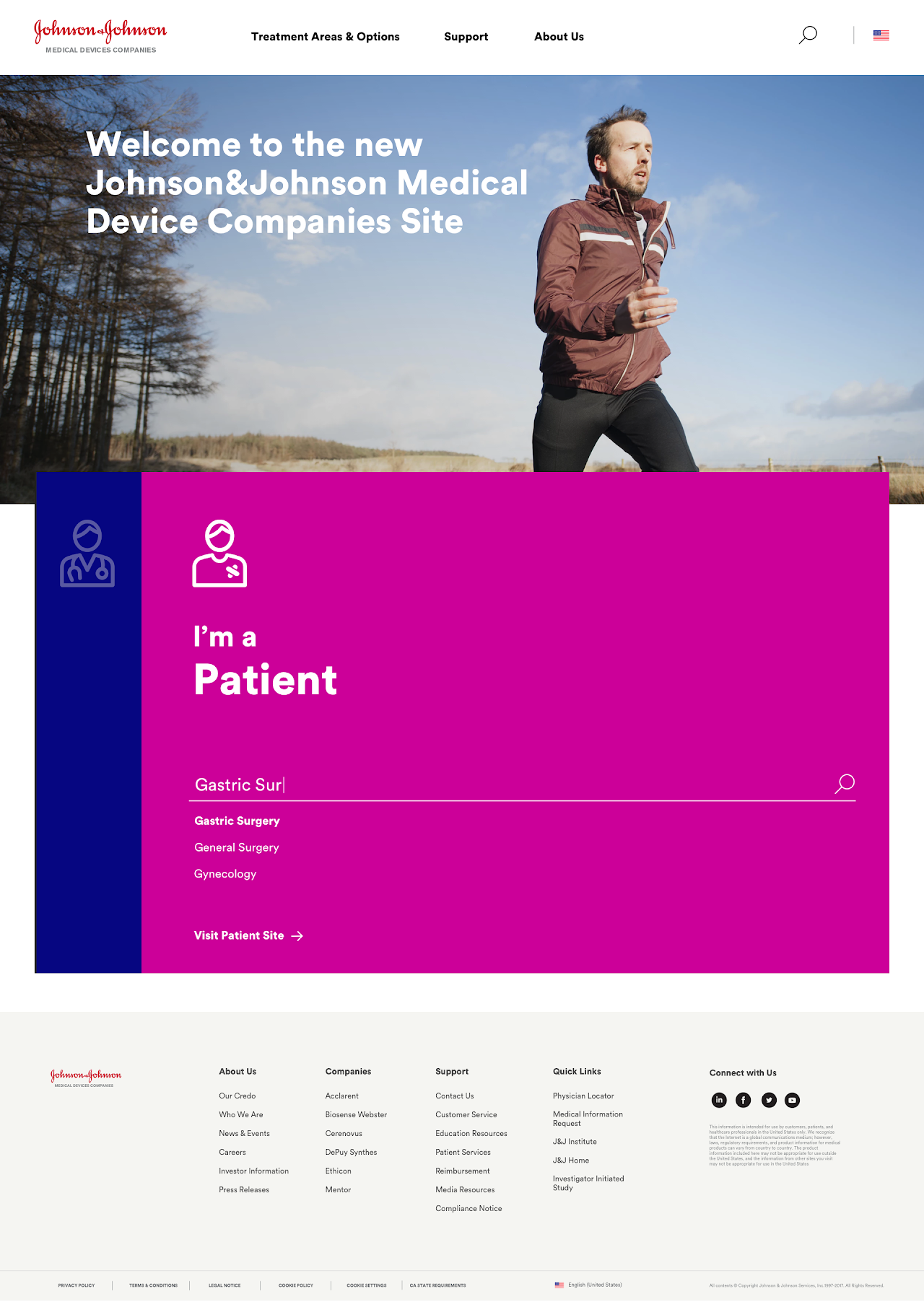
- Innovative Visual Design: The design was clean and modern, in line with the refreshed J&J brand. High-quality imagery, a bold use of color, and clear typography helped to visually communicate J&J’s authority and innovation in the medical devices field.
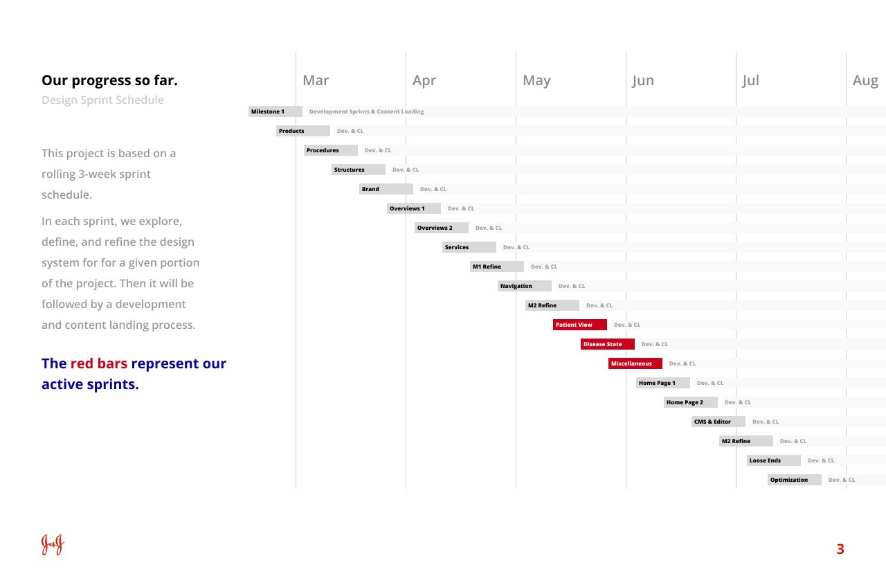
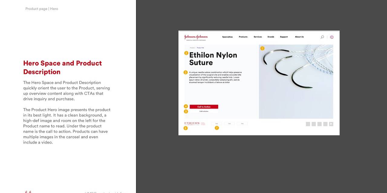
Alongside design development, we crafted comprehensive implementation guidelines to streamline collaboration with the technology team, ensuring a smooth transition from design to development. All of this was executed on a sprint schedule that we defined for the product team, keeping the project on track with clear milestones, deliverables, and room for iterative improvements.
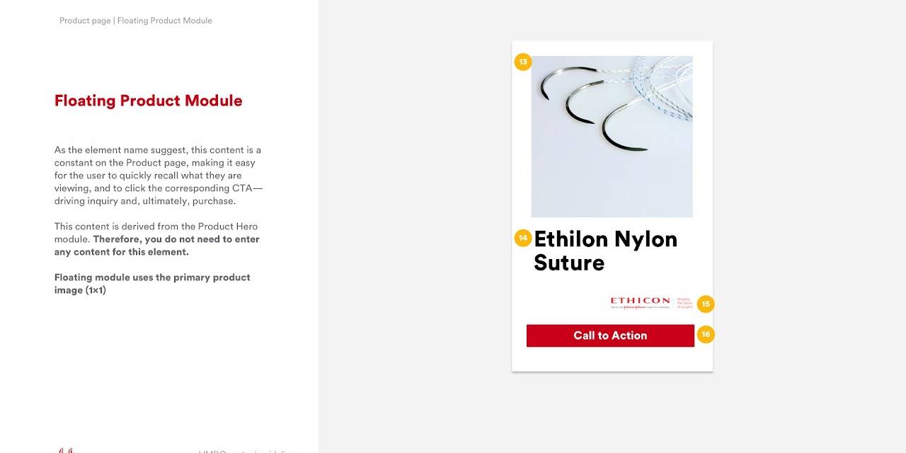
We then developed a modular and atomic design system, breaking down complex components into smaller, reusable elements to ensure consistency across the platform. This approach allowed us to create a scalable framework that could easily adapt to future product needs and innovations while maintaining visual and functional coherence throughout the site. After initial development, the system underwent rigorous usability testing with real-world users, where we refined elements based on feedback to ensure the design was intuitive and aligned with the specific needs of healthcare professionals.
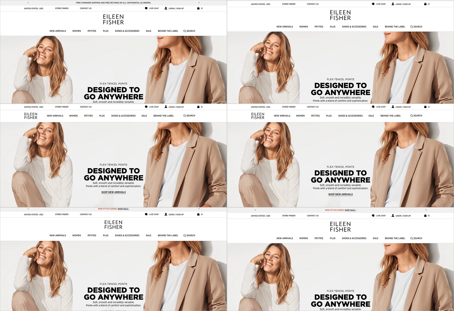
In parallel to all of this structural work we collaborated with the Brand Experience Design team to make decisions on how the new J&J brand would be expressed on a website.
Our process was to take what we could from the work that was finished, apply the work to our prototype, and then send the style guide that developed from that back to the BED team for further refinement and to let any changes we make influence the rest of the brand expression.
04 | COLLABORATIVE EXPERTISE
Throughout the project, we engaged with internal teams and external partners in science and technology. By leveraging J&J’s expertise in surgery, orthopedics, and interventional solutions, combined with external innovations, we created physician and patient-centric products that reflected J&J’s forward-thinking approach to healthcare.
In addition to design and technical development, we continuously refined the user experience through usability testing. Feedback from healthcare professionals allowed us to make iterative improvements, ensuring that the platform remained responsive to user needs and high expectations.
05 | END RESULTS
The new Johnson & Johnson MedTech website achieved the primary goal of consolidating the numerous existing sites into one unified platform. Healthcare professionals now had a streamlined resource to access detailed information on medical devices, improving their ability to make informed decisions quickly.
Key outcomes included:
- Increased User Engagement: The simplified navigation and tailored user journeys made the site more accessible, leading to increased engagement from healthcare professionals.
- Scalable and Future-Ready: The dynamic framework ensured the platform could grow with J&J’s future innovations, allowing for the continuous addition of new content and medical device information.
- Improved Brand Cohesion: By bringing all six companies under the J&J brand, the site reinforced the company’s identity as a leader in medical technology, innovation, and patient care.
Deliverables
- Experience Strategy
- Design Concepts & Wireframes
- Journey Maps
- User Flows
- Heuristic & Landscape Evaluations
- Content Strategy: Taxonomy, Copy Deck x 17 languages
- CMS: Evaluation & Recommendation, User Experience, Training Documentation
- Clickable Prototype
- Executive Presentations (PPT)
06 | CONCLUSION
The creation of the Johnson & Johnson MedTech website was an exercise in collaboration, innovation, and user-centered design. By consolidating a vast array of information into a single, easy-to-navigate platform, we empowered healthcare professionals to make informed decisions more efficiently. This project not only solved immediate challenges but also laid the foundation for J&J’s future digital evolution in the MedTech space.
This case study showcases how building from scratch, rather than simply redesigning, can result in a product that serves both the business and its users in powerful new ways.


